I served as the Director of Graphic Design & Marketing for AMCO International, leading the creative direction for all brand touchpoints within the multi-brand ecosystem. This included crafting distinct brand strategies, marketing campaigns, and designing marketing materials for each brand.
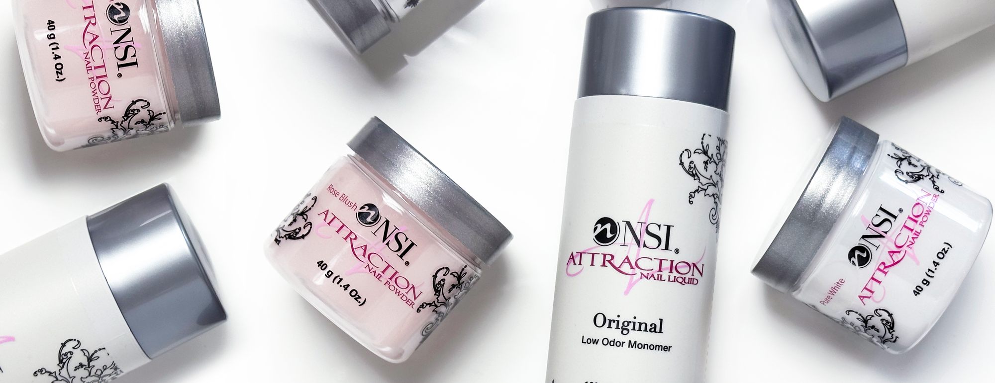
Brands Include: Nail Systems International, Tridox, AMCO Mfg, and AMCO Dental.
AMCO International Branding Project
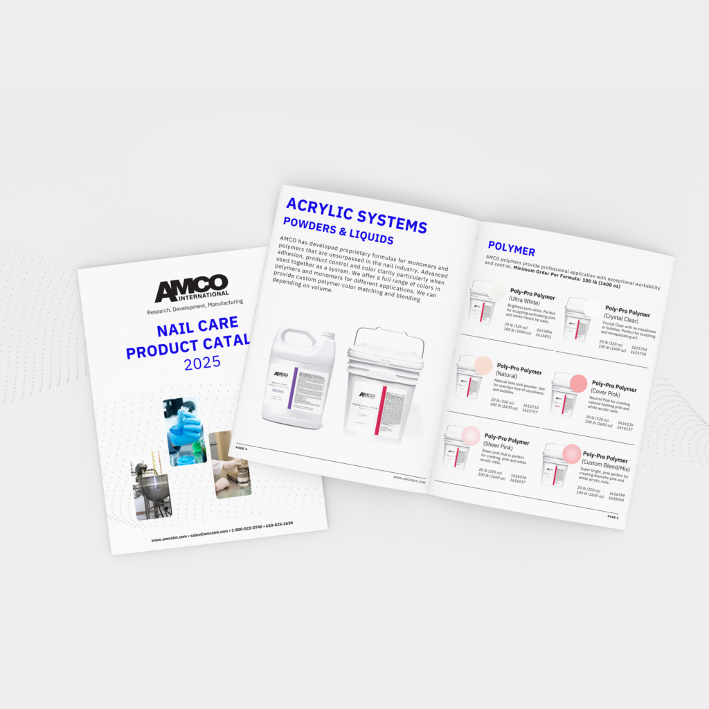
I spearheaded the a new branding strategy and visual style for AMCO as a part of an initiative to bring more visibility, and new customers to the AMCO brand. We chose not to update the logo for the company, as it has been recognized by customers for 20 years, but wanted to give the brand and marketing an updated look. The new branding would need to represent AMCO as a whole, and complement its subsidiary companies.
The new visual identity is fresh and clean, representing quality and trust. The blue is bright and bold, for bold innovations and complemented with science like imagery to reflect the research and development side of the company.
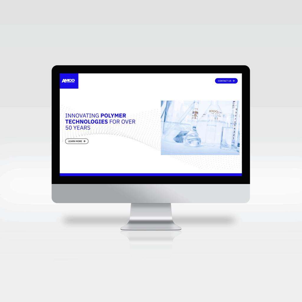
I led the design of the website for AMCO International. The website serves as an overview of the parent company, AMCO Mfg, with a timeline of events and the history of the company.
The website incorporates the new visual identity, utilizing the same imagery and brand elements. Making the website an integral part of the brand system.
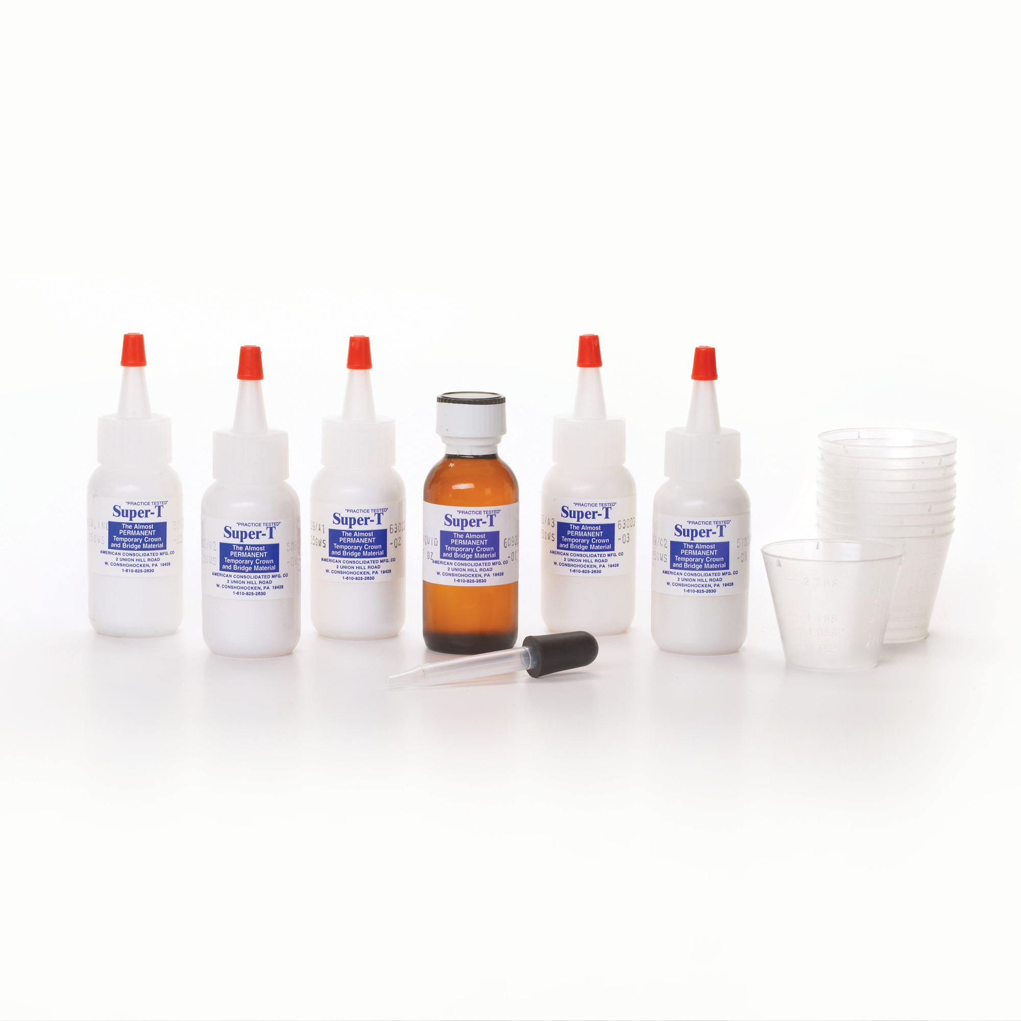
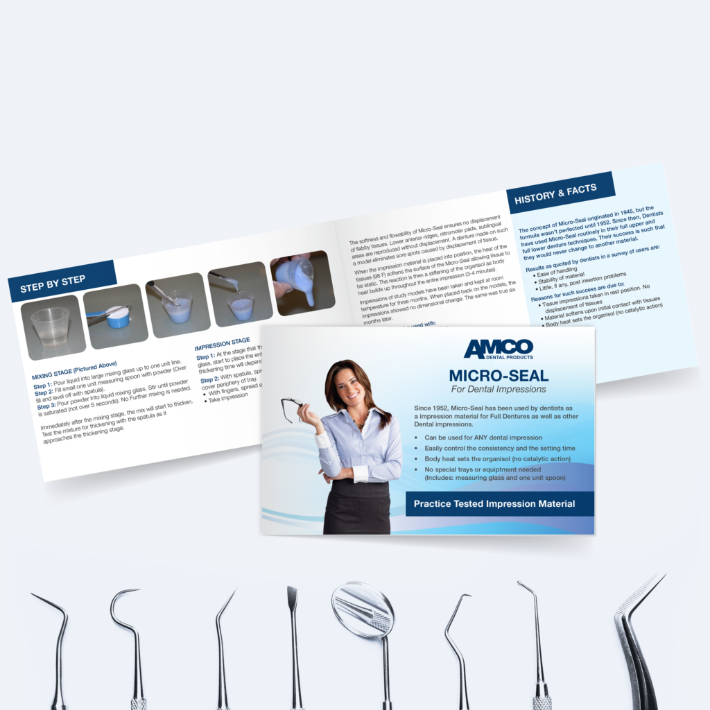
I spearheaded a packaging and instructional redesign for AMCO Dental as part of an initiative to modernize the brand’s look without disrupting product recognition among its long-standing customer base. We chose not to update the logo or product labels, as they had been trusted and recognized by dentists for years, but wanted to give the packaging and marketing a more modern feel. The new design preserves that familiarity while elevating the overall presentation and usability of each kit.
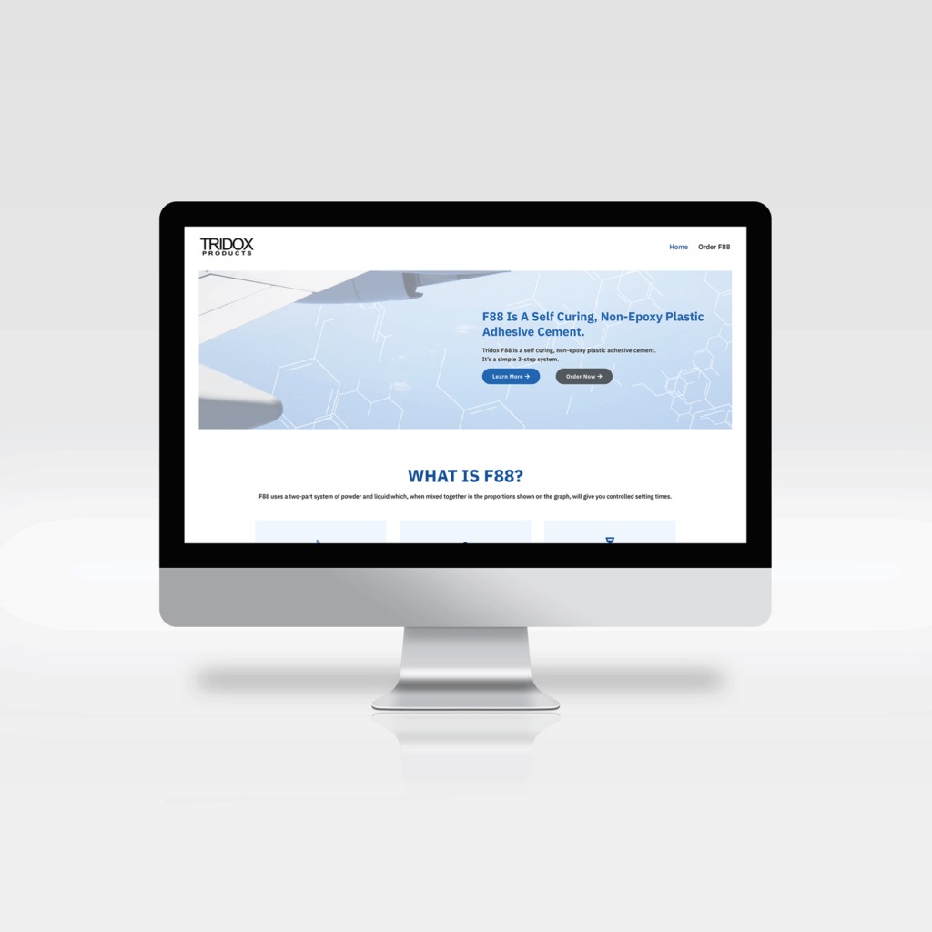
I led the website redesign for Tridox Products. I updated the logo and branding to keep the same look and feel but focused on simplifying the design.
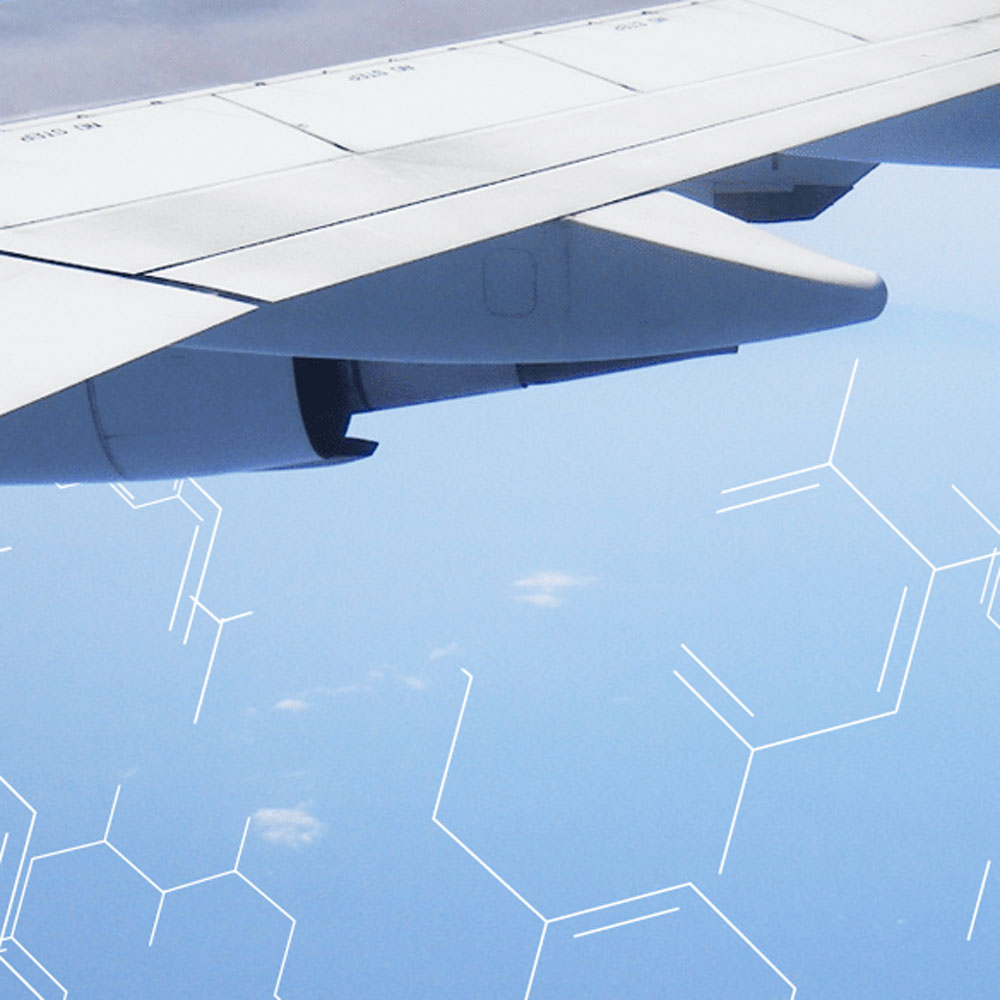
Since this product is an industrial adhesive product that is mostly used in aerospace and engineering applications, I chose imagery of planes and molecules to represent the brand.
I served as Art Director & Marketing Director, leading design direction across Brand, Product, User Experience, and Marketing. I spearheaded a full brand redesign—including logo, packaging, and marketing strategy—and directed integrated product launch campaigns across print, digital, social media, and e-commerce, as well as sales collateral and email marketing (EDM) for both B2B and DTC audiences, ultimately driving brand awareness and sales on a global scale.