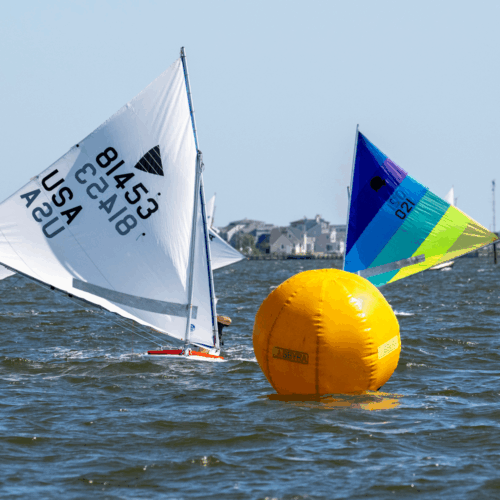
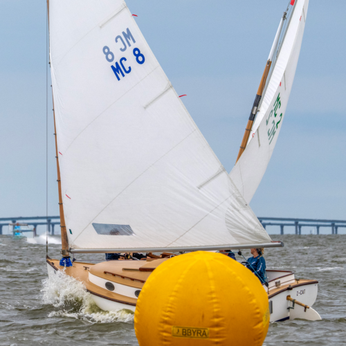
Sailing is an incredibly competitive sport. And when you are in it, you are in it to win.
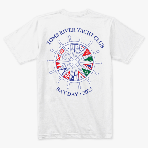
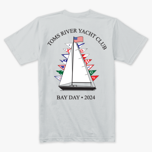
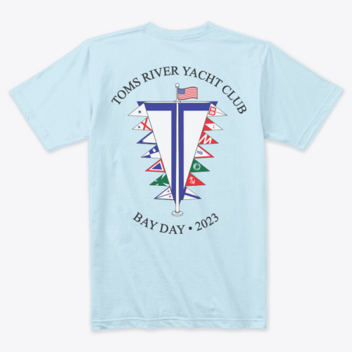
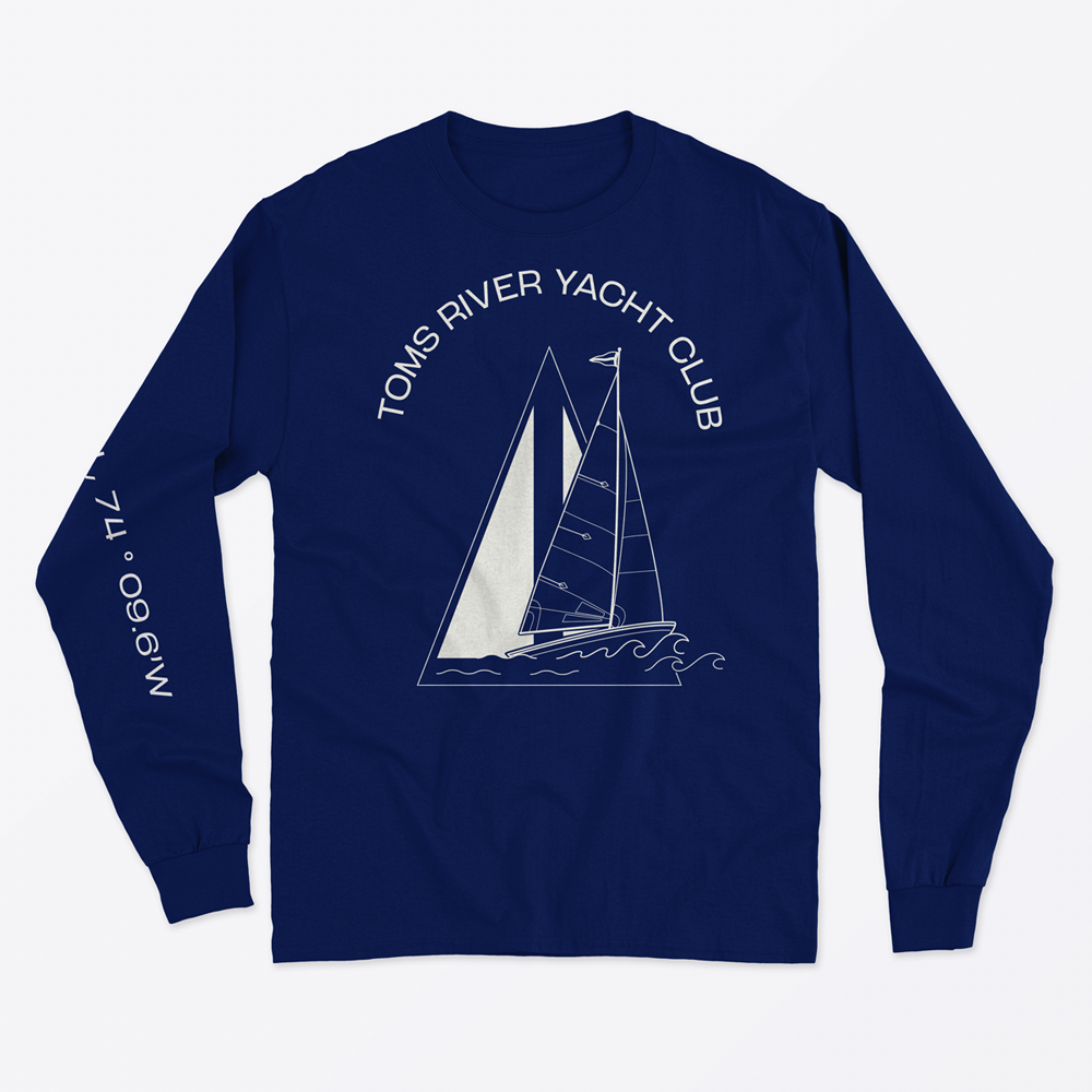
I was asked to design shirts for a special boat race on the Barnegat Bay, Bay Day. Bay Day is the one race in the summertime that all participating sailing clubs come to one specific yacht club to compete.
For these designs, I pulled inspiration from recognizable sailing themes, while still highlighting the host yacht club, Toms River Yacht Club. Each year the design different, and no idea is recycled, sailors are excited to see the design for the year.
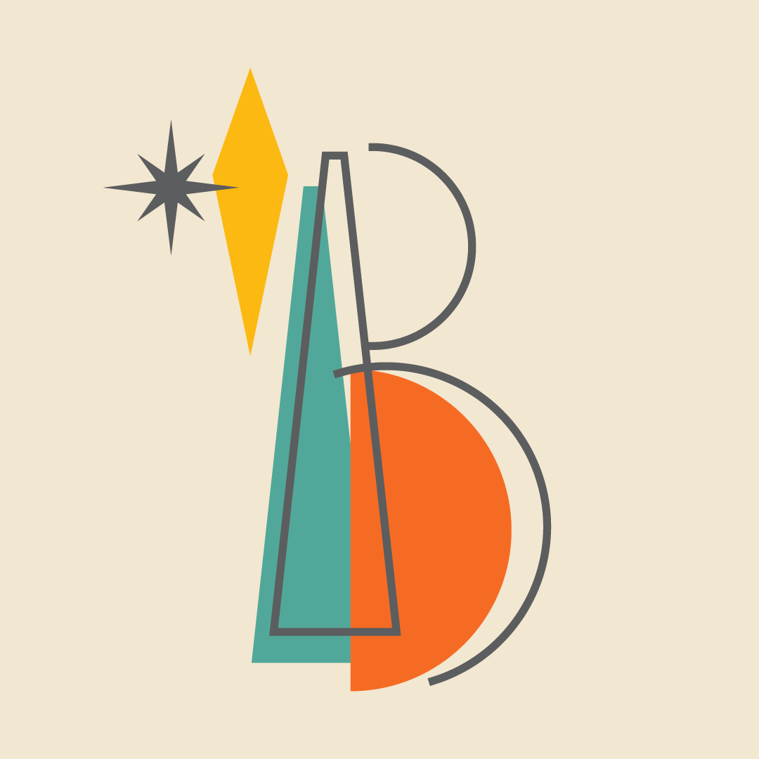
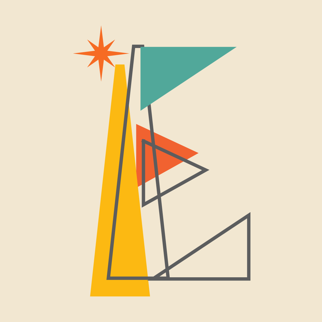
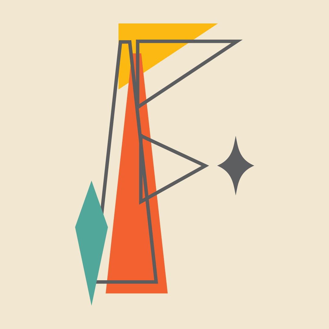
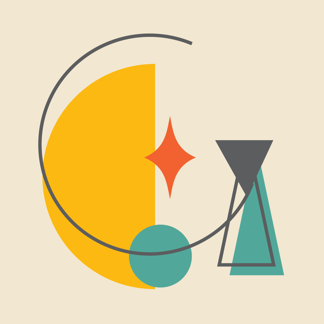
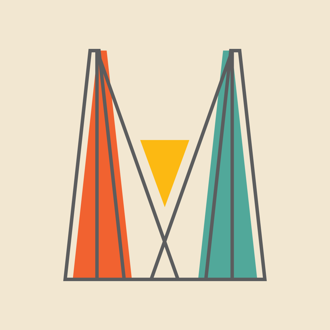
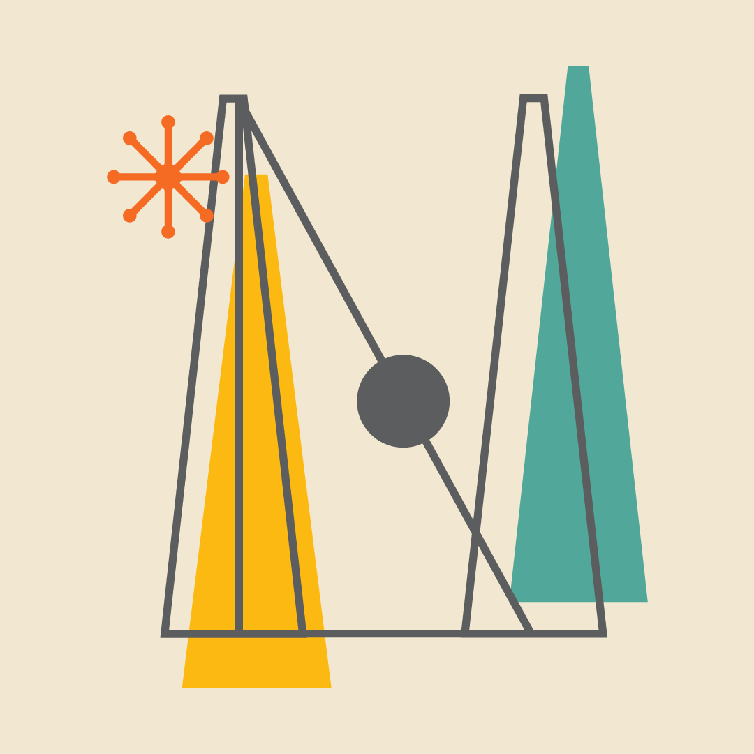
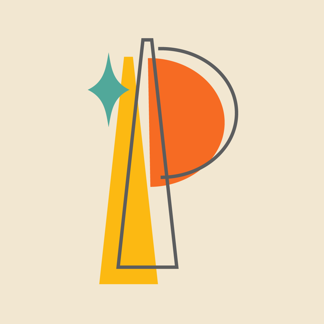
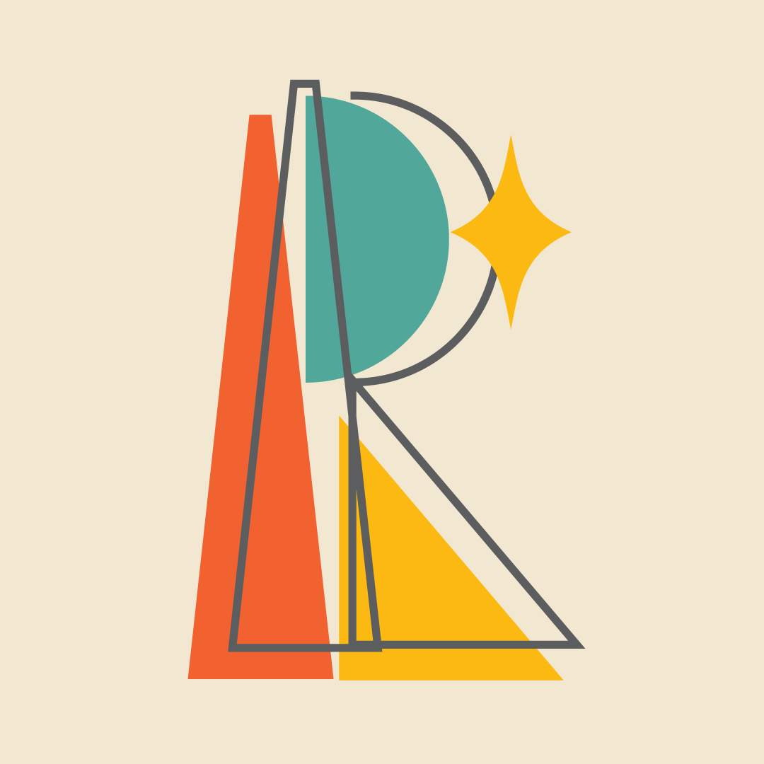
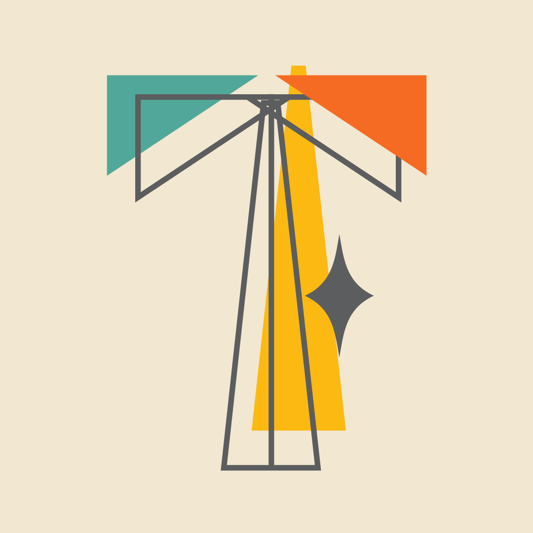
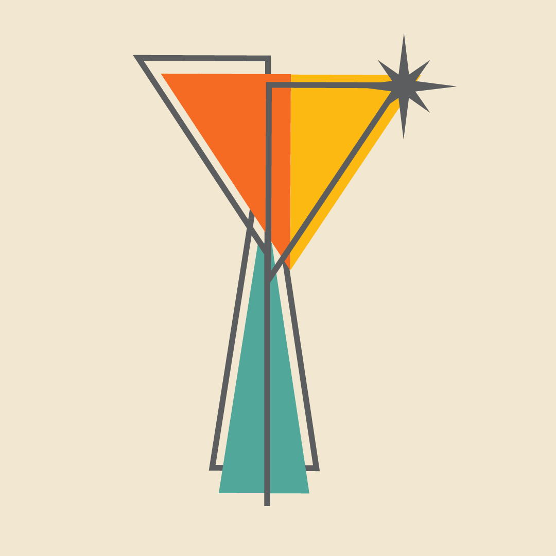
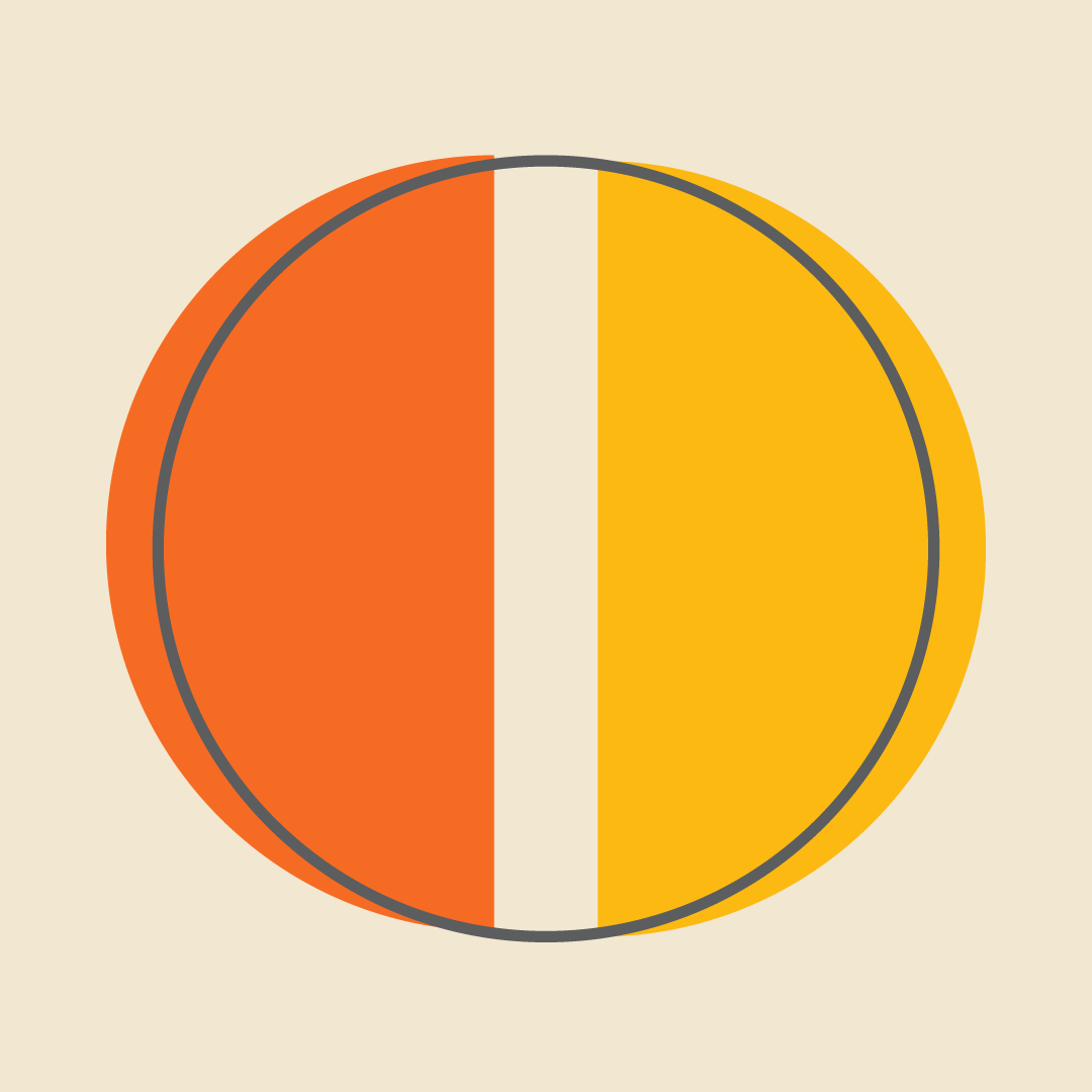
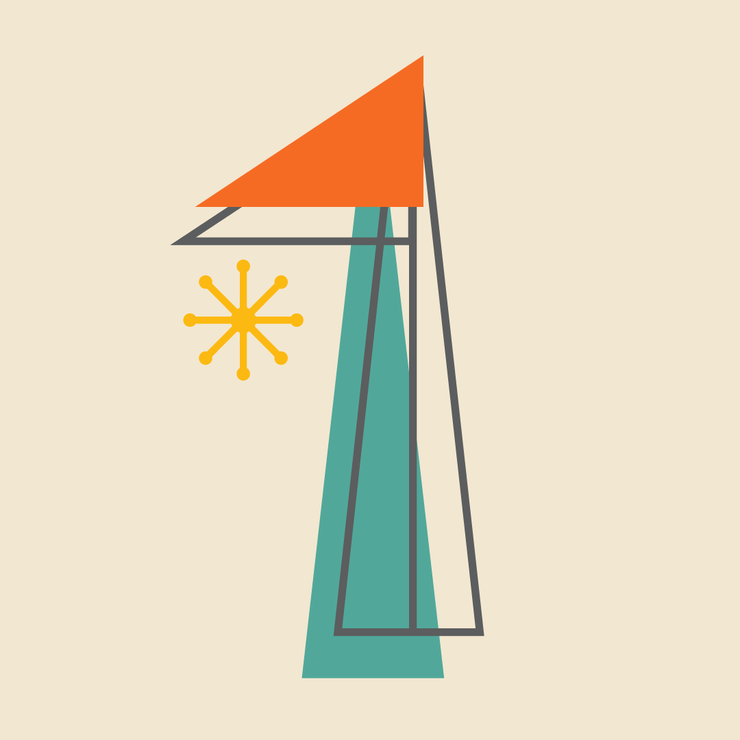
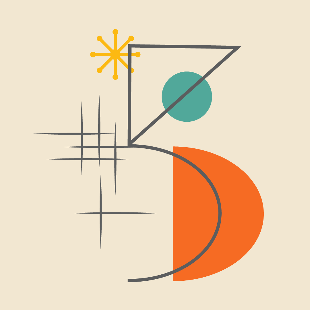
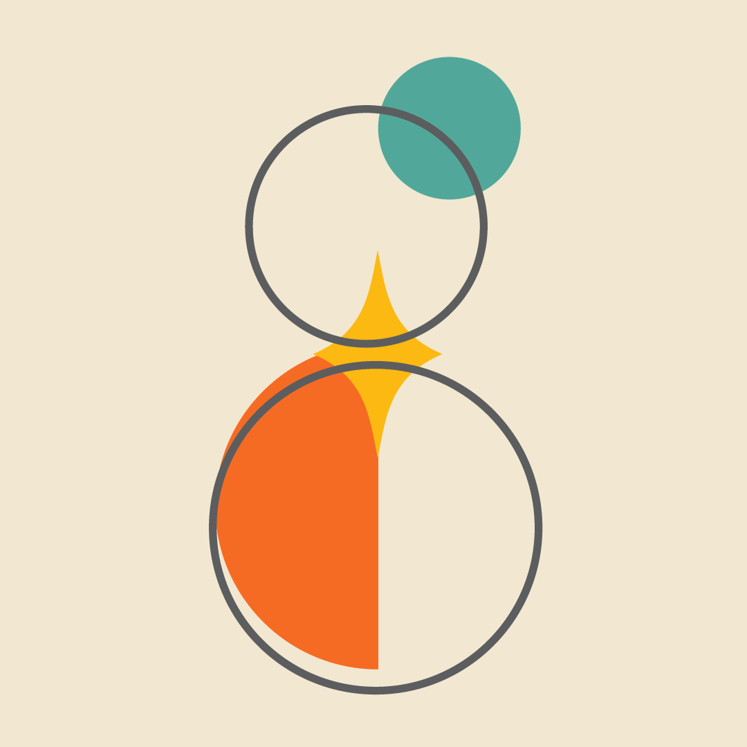
The Mid-Century Modern Themed Alphabet is a personal project created as a part of the 36 days of type challenge. The style is modeled after the simplistic designs found in the 1940s and 50s American “space age” design period. The alphabet consists of 26 letters and 10 numerical characters. It also includes 2 special characters; a punctuation mark called the interrobang and an ampersand.
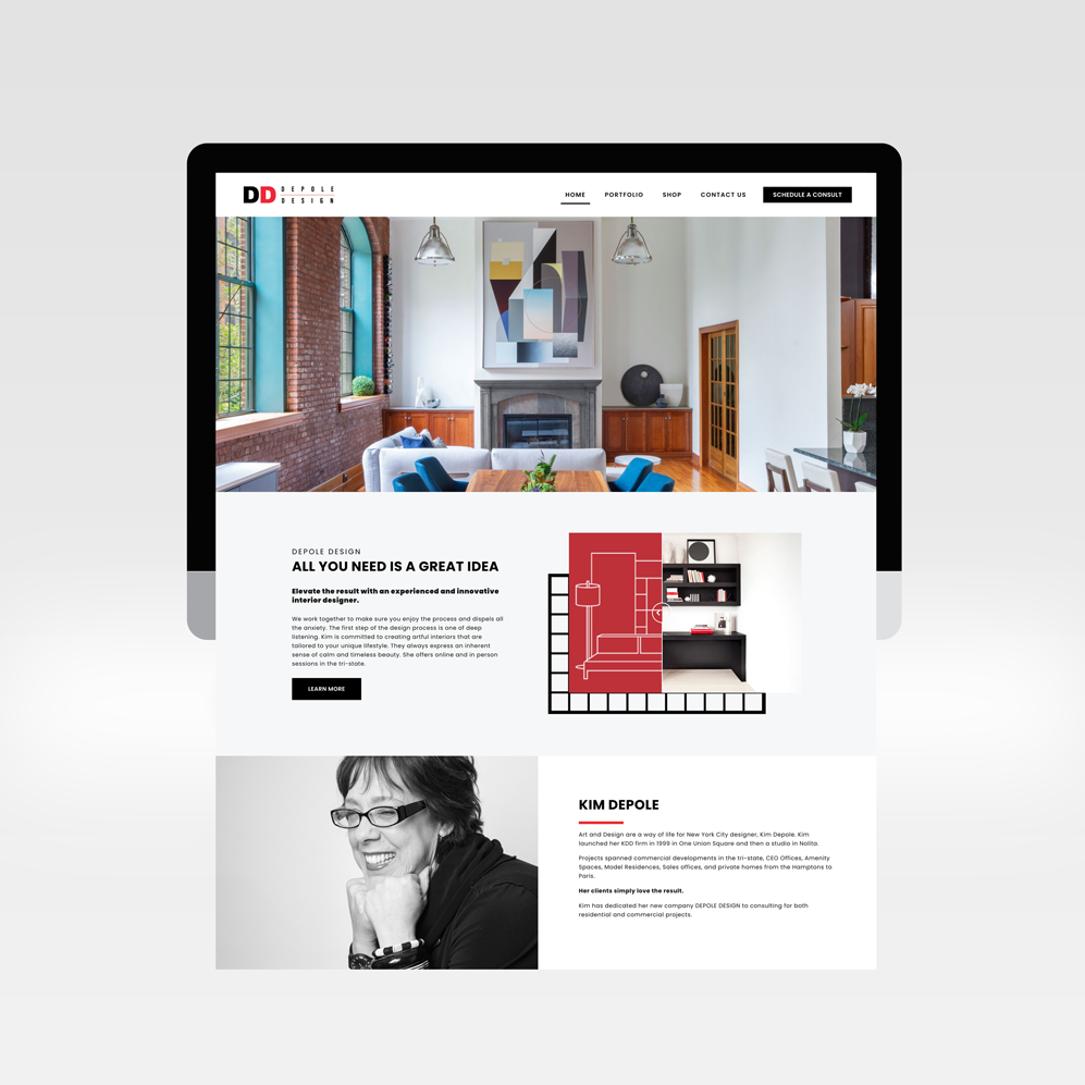
Depole Design is an interior design firm serving both residential and commercial projects in the NYC area. This project was a website redesign that focused on the positive impact of their work and showcased their portfolio. The end result was a simple design that is easy to navigate and beautifully showcases the portfolio of work of Depole Design and its offerings.
The Website
Depole Design needed a total website redesign that helped to showcase and bring awareness of the impact of their work, and the website needed to be accessible and look good on all devices.
When approaching this project we wanted to simplify the website and make the website elevate the clients’ work. The design of the website makes the projects appealing, and easy to navigate. The before and after images of the projects bring attention to the designers ability to transform a space.
We also integrated a 3rd party sales solution that promotes a series of curated collections chosen by the designer. Calendly was also integrated for booking and scheduling future client appointments.
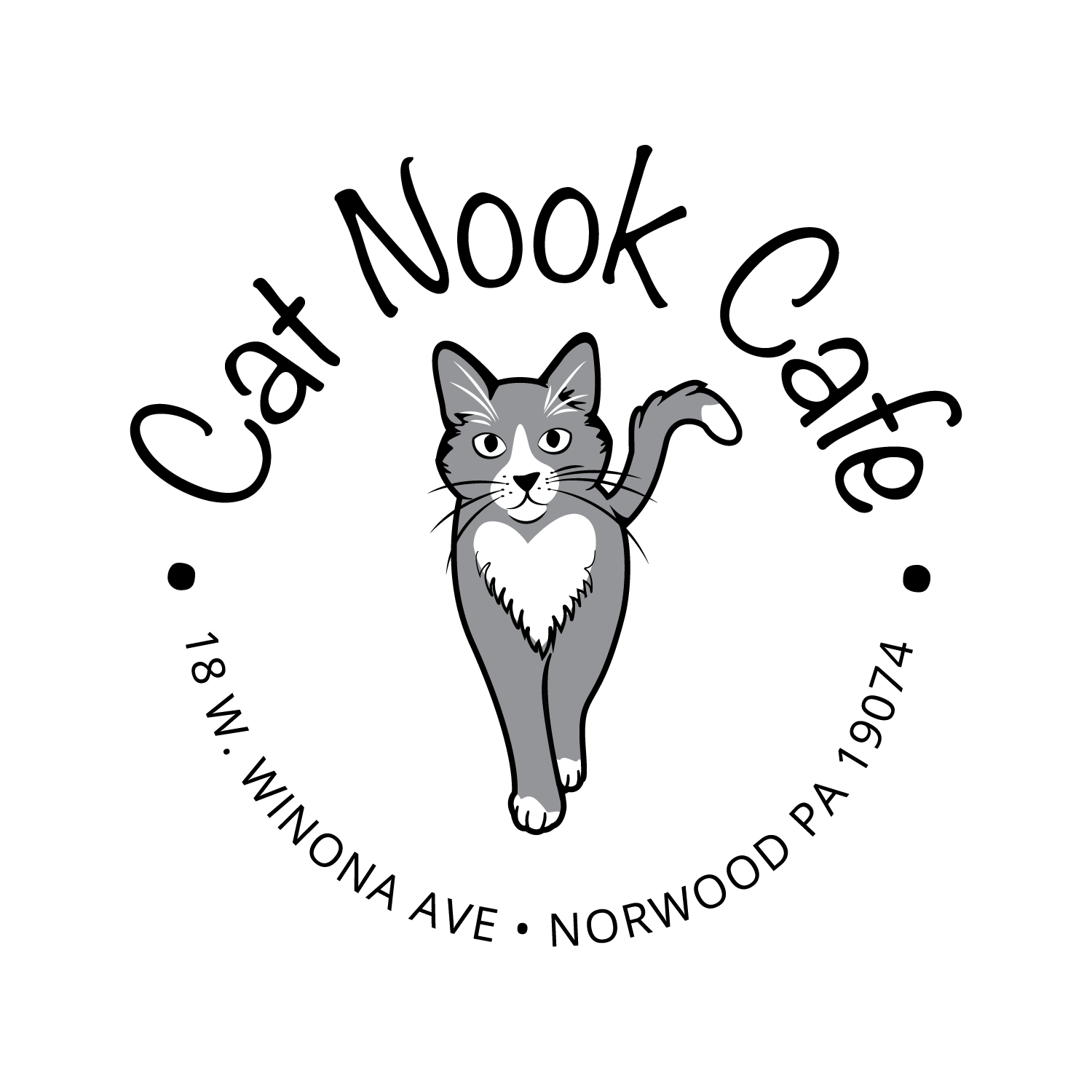
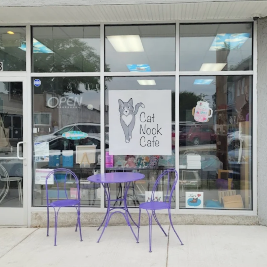
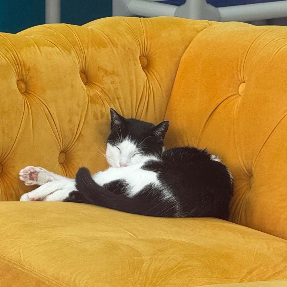
Cat Nook Cafe needed a logo that represented the fun, and cheerful personality of the cats available for adoption. Something that stood out from other cat cafes and could also reflect the values, mission, and community. The logo and branding match the aesthetic of the physical space and the activities that are hosted at the physical location.
Since 2004, ACDC Rescue has provided thoughtful and needed community programs like T-N-R, low-cost spay/neuter clinics, and educational speaking engagements. These programs facilitated connecting the community to each other and the resources they need while promoting the awareness of animal homelessness, healthy pet interactions and life-long pet ownership. ACDC launched Cat Nook Cafe, a cat cafe and physical space for ongoing outreach and education development.
Previous
Next
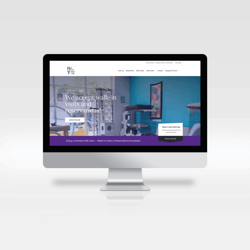
The Website
Cat Nook Cafe needed a website, something clean and sleek but also inviting and welcoming. A cat cafe is not the same as a adoption center, it is a fun place to visit. While the cats are available for adoption, the purpose of the cafe is to provide a safe space for visitors and cats to hang out together. A place to relax, hang out with friends and make some furry friends along the way!
The website needed to be multi-functional. Serving as a portal to collect donations, promote adoption, allow guests to book time to visit, and sell tickets for events.