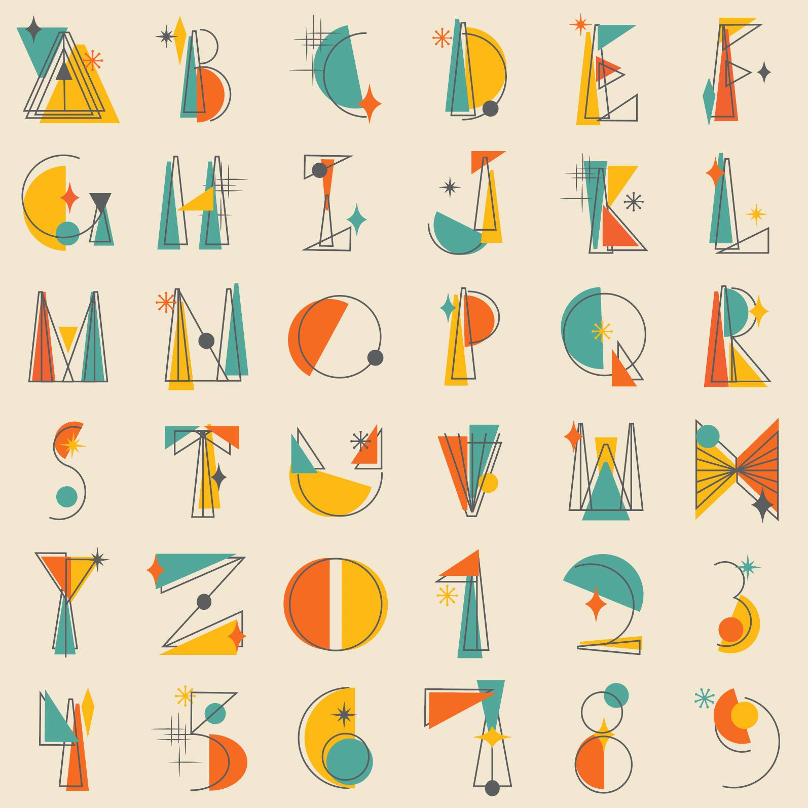
I have created Illustrations for a variety of purposes, from merchandise design to personal projects. Each design is skillfully crafted with intention and purpose.
I have designed and developed websites for a range of companies at different stages in business. From concept, wire framing, beta testing and final development, I have played an integral role in the full cycle of web development.
Skills & Software:
UX/UI, HTML & CSS, Figma, Adobe XD, WordPress, Shopify, Squarespace and Wix
AMCO International Website
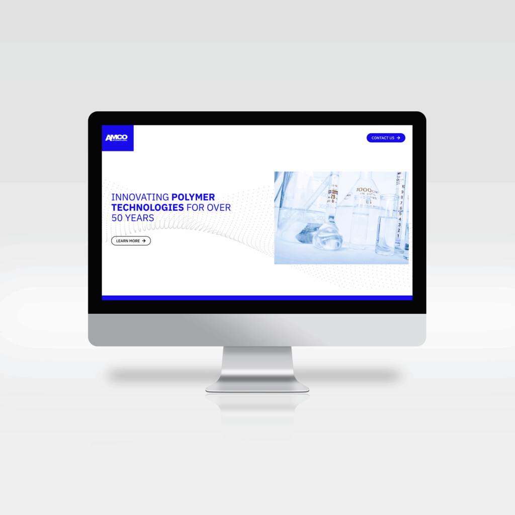
I led the design of the website for AMCO International. The website serves as an overview of the parent company, AMCO Mfg, with a timeline of events and the history of the company.
The website incorporates the new visual identity, utilizing the same imagery and brand elements. Making the website an integral part of the brand system.
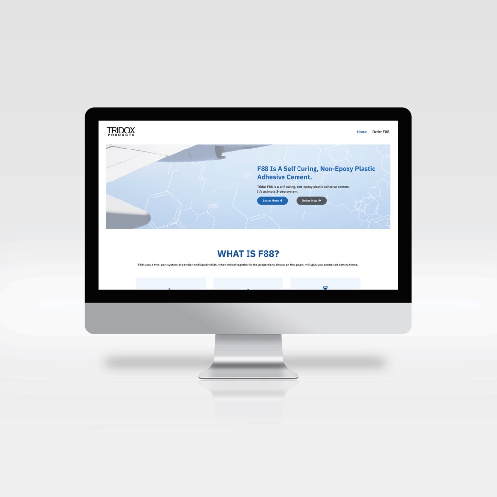
I led the website redesign for Tridox Products. I updated the logo and branding to keep the same look and feel but focused on simplifying the design.
Since this product is an industrial adhesive product that is mostly used in aerospace and engineering applications, I chose imagery of planes and molecules to represent the brand.
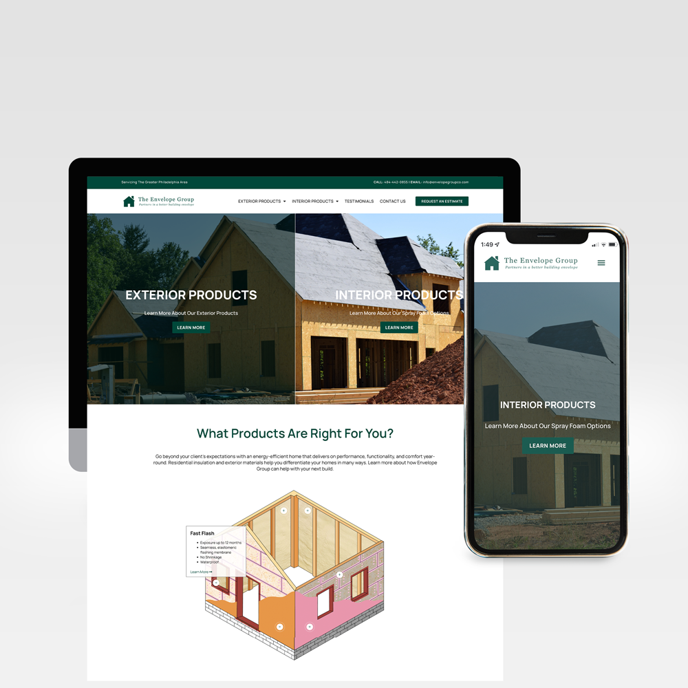
The Envelope Group needed a website that could feature two different types of products: Interior and Exterior. We decided on a homepage hero that is split in two and streamlined the navigation to show only two categories.
A custom illustration was also created to help show the different product offerings and their uses to help further clarify what they may be looking for.
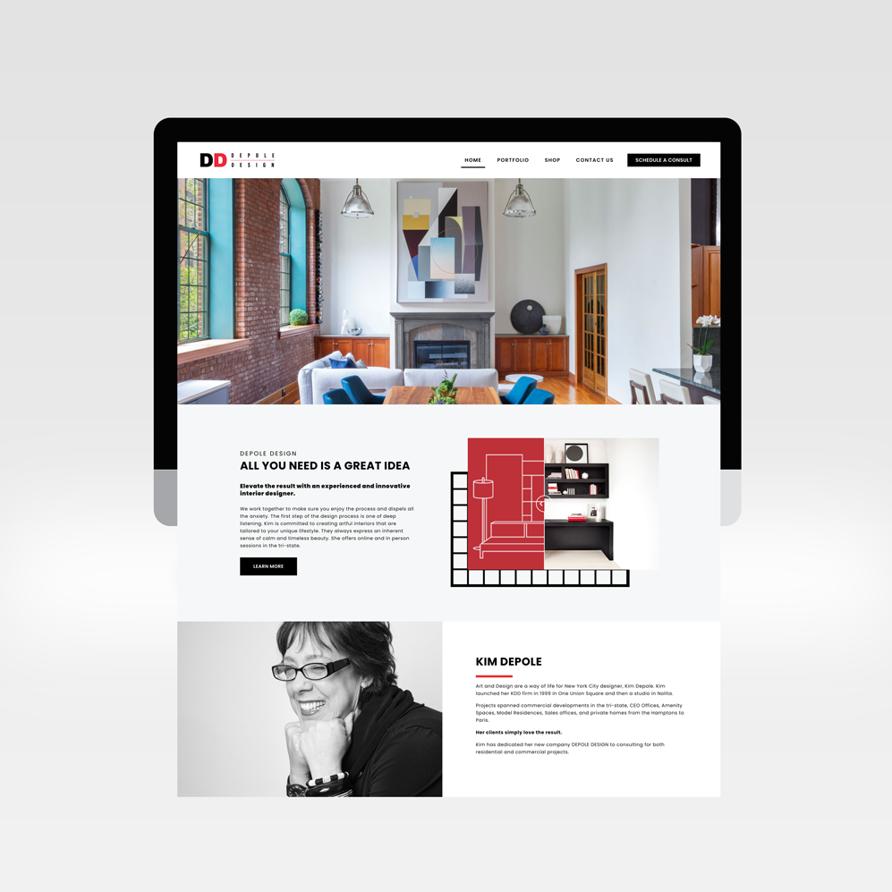
Depole Design approached me about a total website redesign that helped to showcase and bring awareness of the impact of their work.
When approaching this project I wanted to simplify the website and elevate their client work. The design of the website makes the projects appealing, and easy to navigate. The before and after images of the projects bring attention to the designers ability to transform a space.
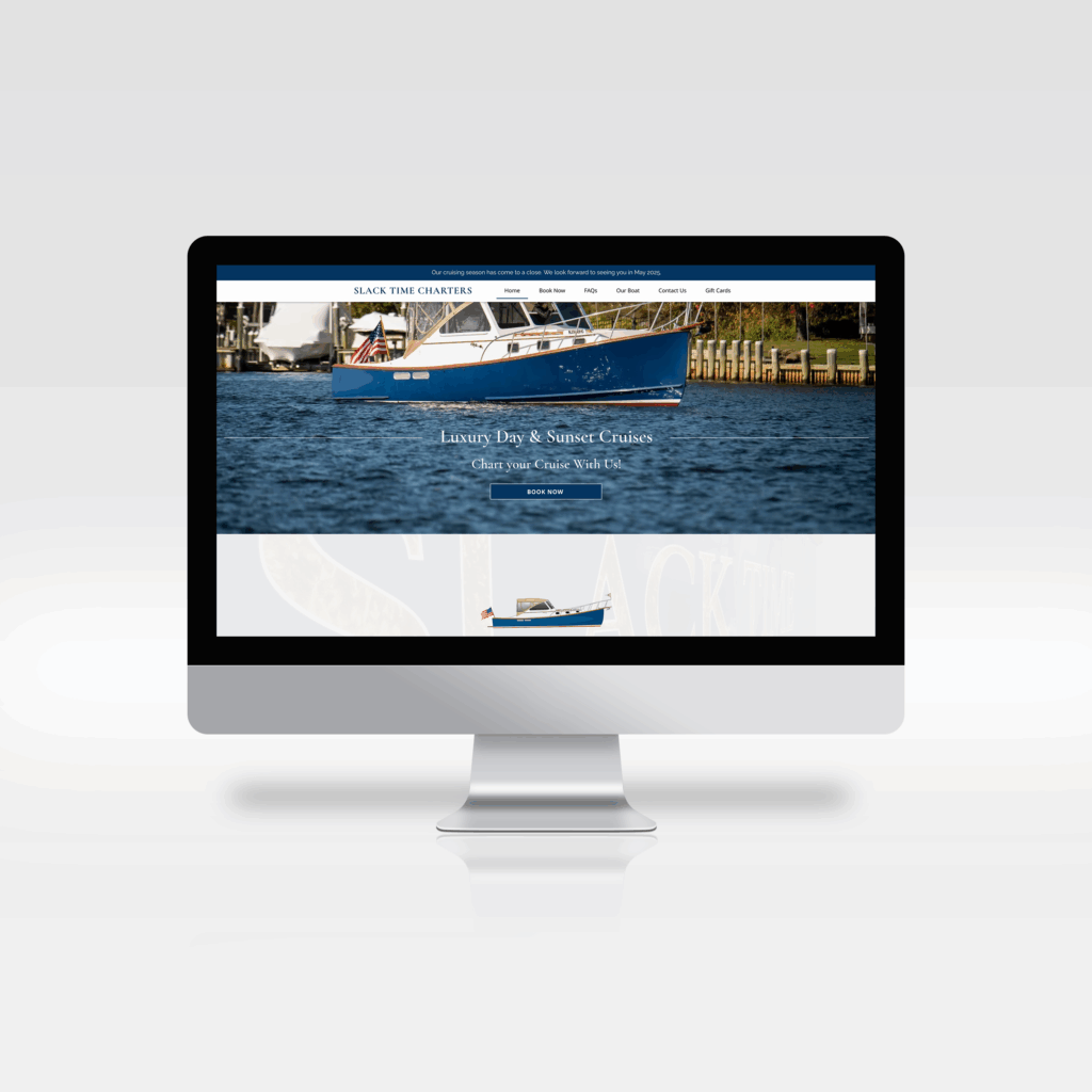
Captain Rick approached me about designing the website for his luxury boat charter business, Slack Time Charters. I created a custom signal flag and elevated the branding.
I designed the website to embody the experience passengers have when booking a cruise on Slack Time, and set up the online booking platform to make a seamless experience.
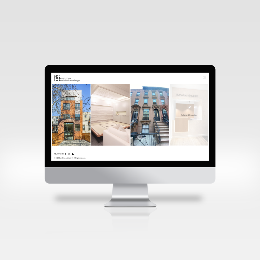
For Evan Chan Architect, I wanted to create a website that fully highlights their work in a simple and clean aesthetic. The website features beautiful photos of their portfolio and highlights the high quality they bring to all of their client work.
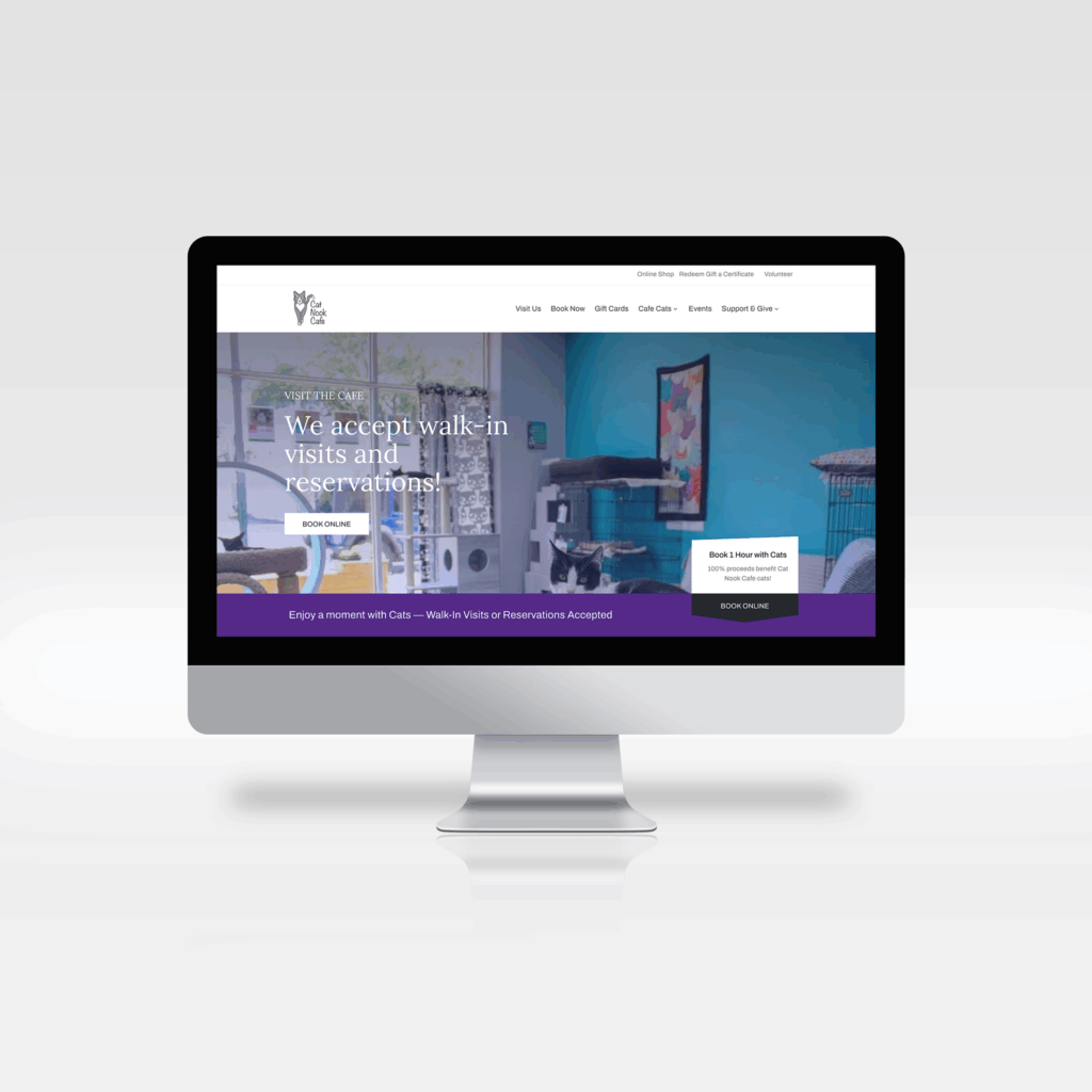
Cat Nook Cafe needed a website, something clean and sleek but also inviting and welcoming. A cat cafe is not the same as a adoption center, it is a fun place to visit. While the cats are available for adoption, the purpose of the cafe is to provide a safe space for visitors and cats to hang out together. A place to relax, hang out with friends and make some furry friends along the way!
The website needed to be multi-functional. Serving as a portal to collect donations, promote adoption, allow guests to book time to visit, and sell tickets for events.
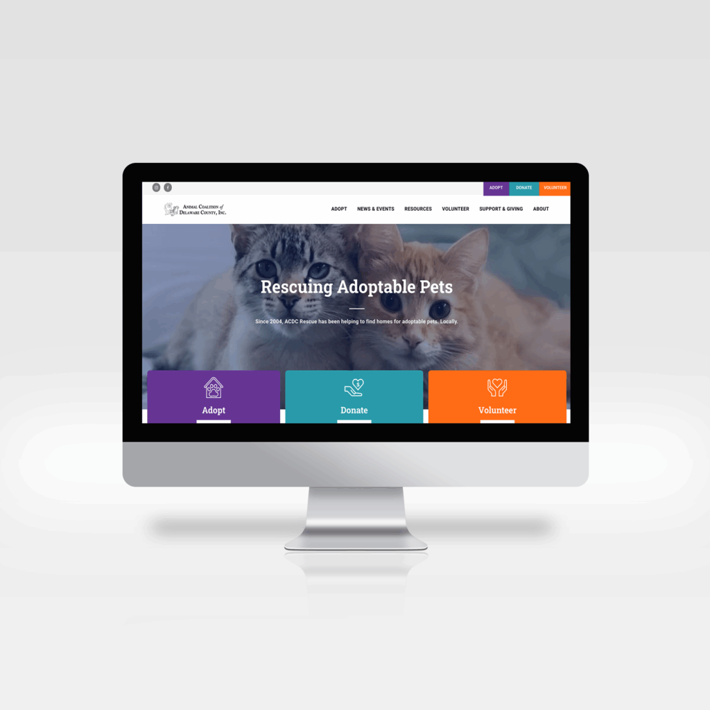
I designed and developed the website for ACDC Rescue, a non-profit animal rescue out of Delaware county Pennsylvania. They needed a total website re-design, something that reflected the personality of the non-profit, and could have their animal adoption CRM integrated.
When approached with this project, the biggest pain point was that the website was not mobile friendly. This made it very difficult for potential adopters to see the pets to apply for them.
The secondary pain point was that their mission to educate the public was hidden behind layers of linking pages. Priority 2 was bringing their important information front and center so it could be easily accessed.
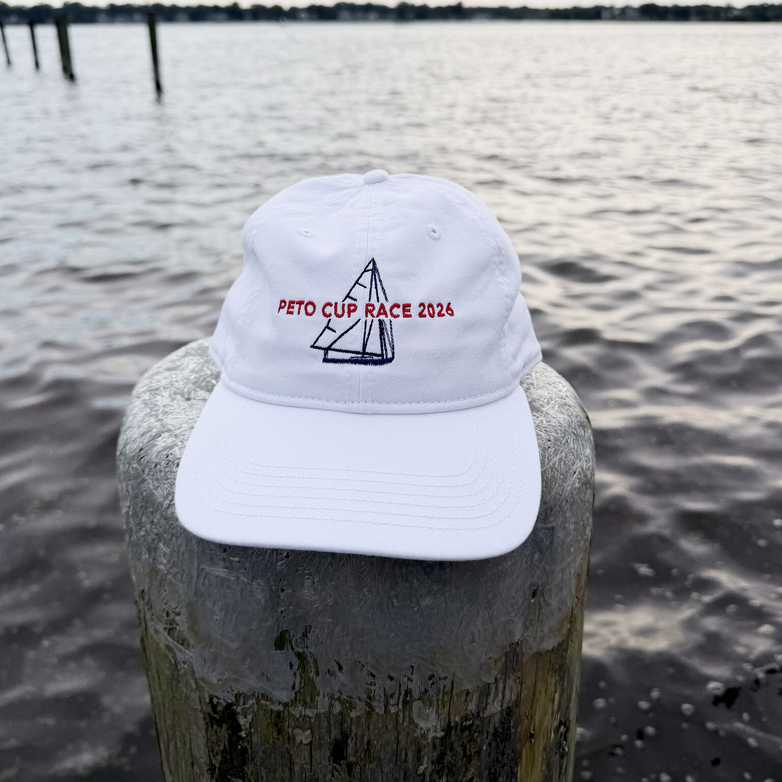
I created and illustrated the designs for various nationally recognized yachting associations. These designs have been created for different social and regatta events, including promotional posters for races and events, silkscreen graphics for shirts and merchandise, and digital flyers.
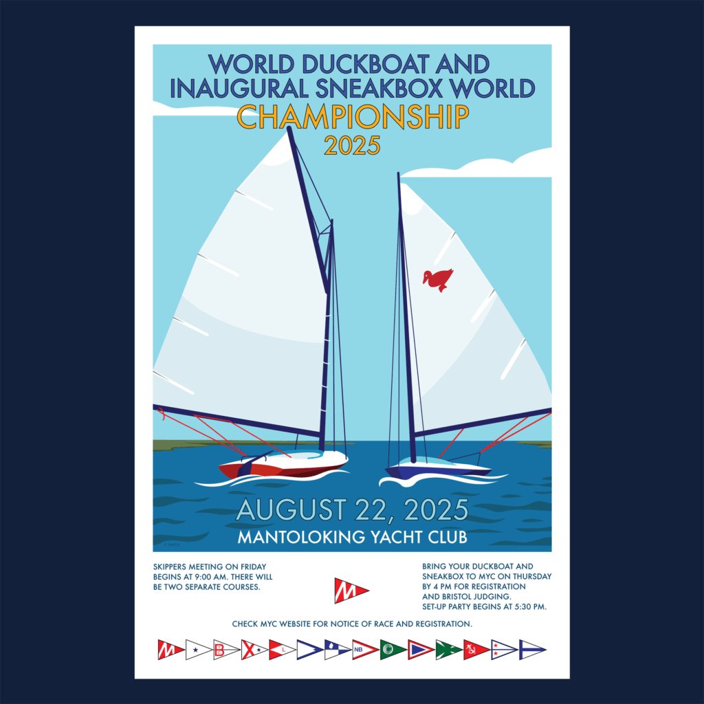
Sneakbox & Duckboat World Poster
I created the poster design for the 2025 World Duckboat and Inaugural Sneakbox World Championship regatta. For this design, I wanted something clean and classy. I drew inspiration from the style of national park posters and flat design tourist posters. The boats are both drawn to be structurally accurate, and representative of their comparable sizes.
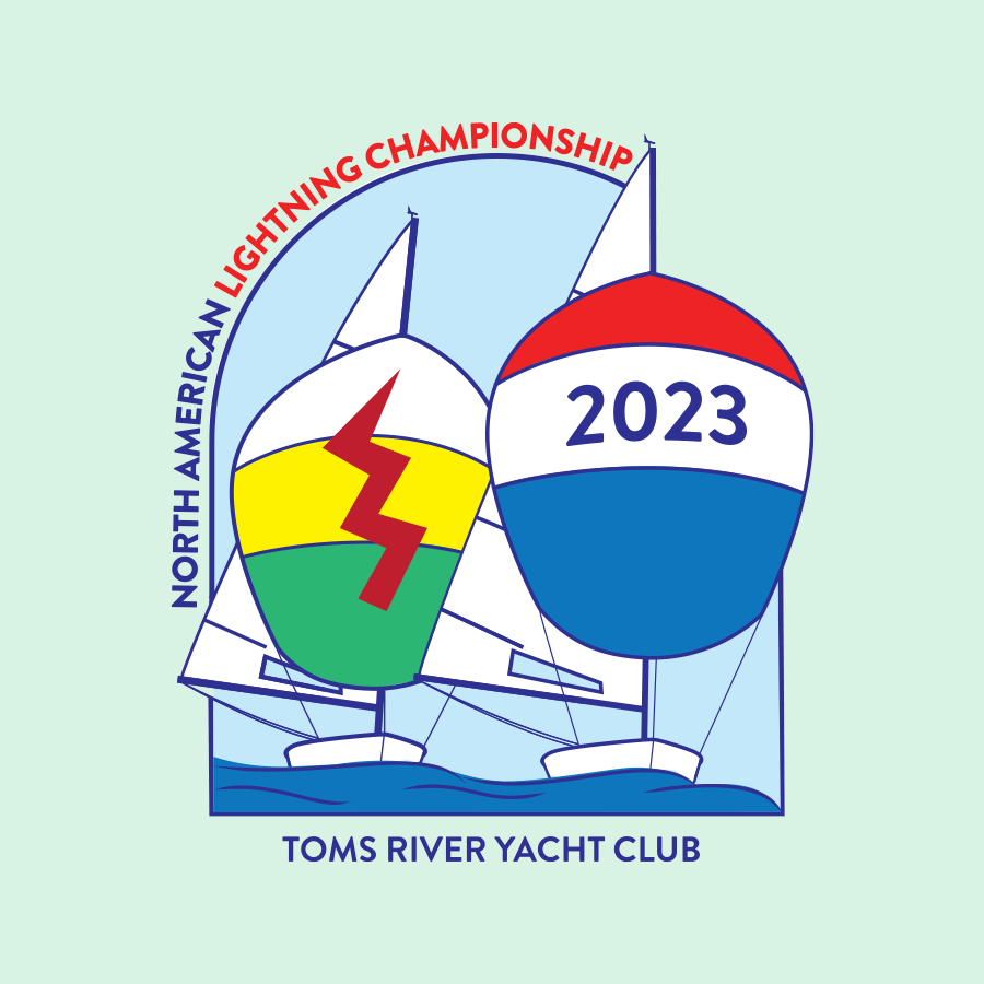
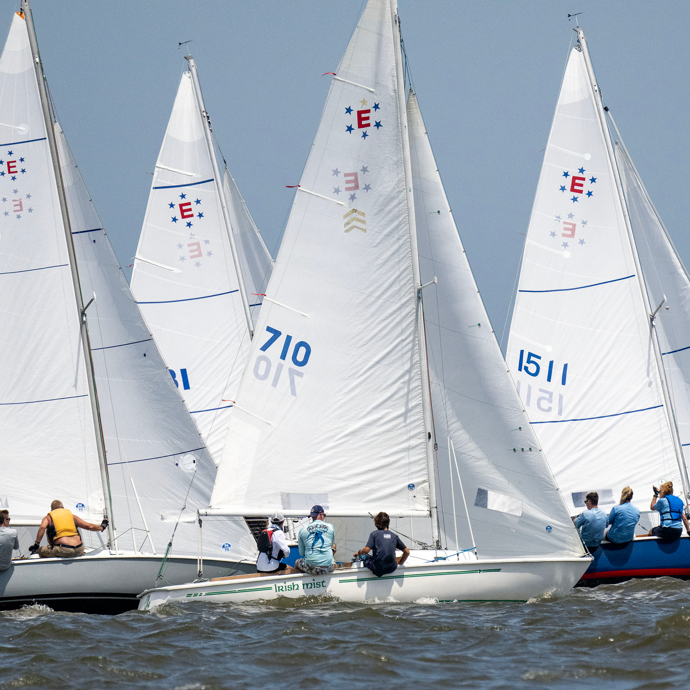
I created and illustrated the design for the North American Lightning National Championship Regatta, held at Toms River Yacht Club in 2023. The illustration showcases two colorful spinnaker sails, one with the Lightning National Fleet logo and the other with the year, and serves as a reminder of the high energy regatta for spectators and sailors alike.
This sporty design was created to showcase the Lightning class sailboat, and the sport of sailing while still being playful. The boats featured are structurally correct but stylized for an eye-catching design, making you want to get out there and sail fast.
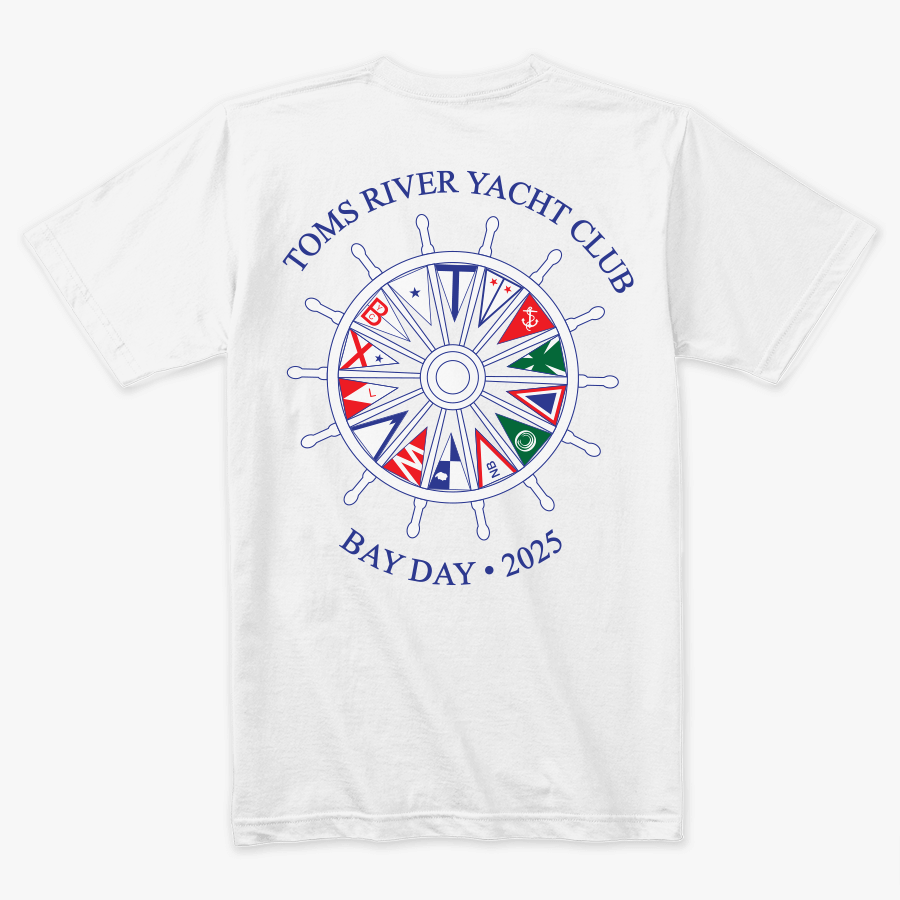
Toms River Yacht Club asked me to design shirts for their Bay Day, the one summertime race where all participating sailing clubs come to a specific yacht club to compete.
For these designs, I pulled inspiration from recognizable sailing themes, while still highlighting the host yacht club, Toms River Yacht Club. Each year the design is different, and no idea is recycled, sailors are excited to see the design for the year.
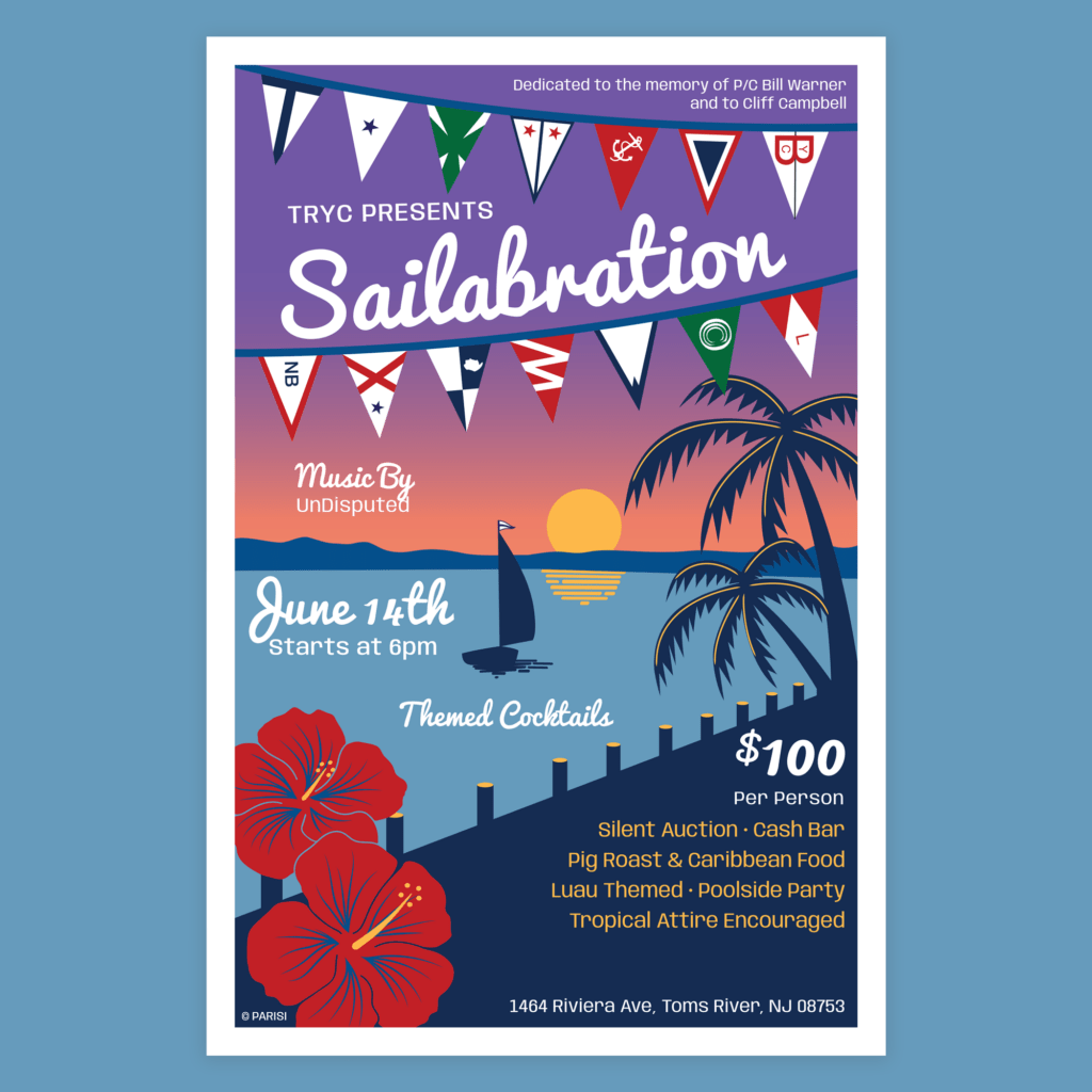
Toms River Yacht Club asked me to design a fun poster for the 2025 Sailabration party that reflected the events’ Luau theme. Sailabration is a fundraising event held each year to support the Barnegat Bay Yacht Racing Association.
I found inspiration in retro band posters, specifically yacht rock music like the Beach Boys and Jimmy Buffett. I also wanted to tie in the beautiful sunset view along the river.
I served as the Director of Graphic Design & Marketing for AMCO International Manufacturing, leading the creative direction for all brand touchpoints within the multi-brand ecosystem. This included crafting distinct brand strategies, marketing campaigns, and designing marketing materials for each brand.
Brands Include: Nail Systems International, Tridox, AMCO Mfg, and AMCO Dental.
AMCO International Branding Project
I spearheaded the a new branding strategy and visual style for AMCO as a part of an initiative to bring more visibility, and new customers to the AMCO brand. We chose not to update the logo for the company, as it has been recognized by customers for 20 years, but wanted to give the brand and marketing an updated look. The new branding would need to represent AMCO as a whole, and complement its subsidiary companies.
The new visual identity is fresh and clean, representing quality and trust. The blue is bright and bold, for bold innovations and complemented with science like imagery to reflect the research and development side of the company.
I led the design of the website for AMCO International. The website serves as an overview of the parent company, AMCO Mfg, with a timeline of events and the history of the company.
The website incorporates the new visual identity, utilizing the same imagery and brand elements. Making the website an integral part of the brand system.
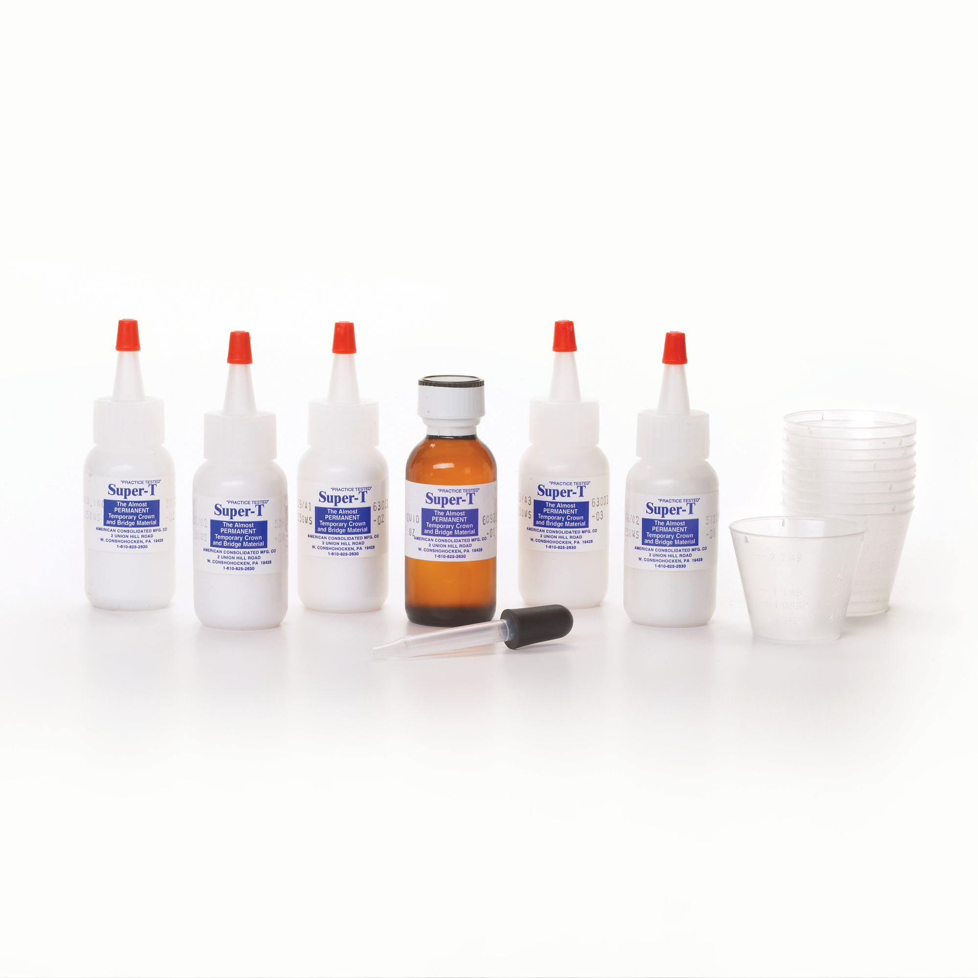
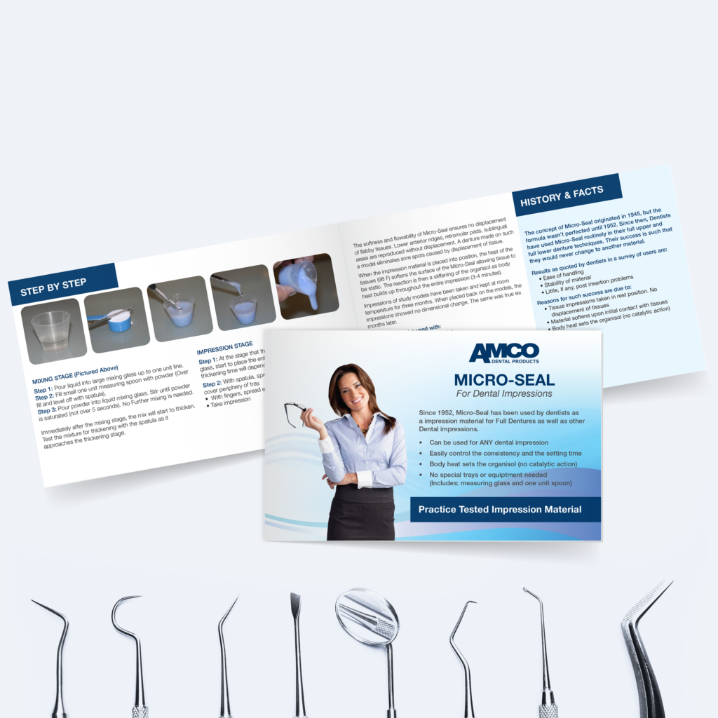
I spearheaded a packaging and instructional redesign for AMCO Dental as part of an initiative to modernize the brand’s look without disrupting product recognition among its long-standing customer base. We chose not to update the logo or product labels, as they had been trusted and recognized by dentists for years, but wanted to give the packaging and marketing a more modern feel. The new design preserves that familiarity while elevating the overall presentation and usability of each kit.
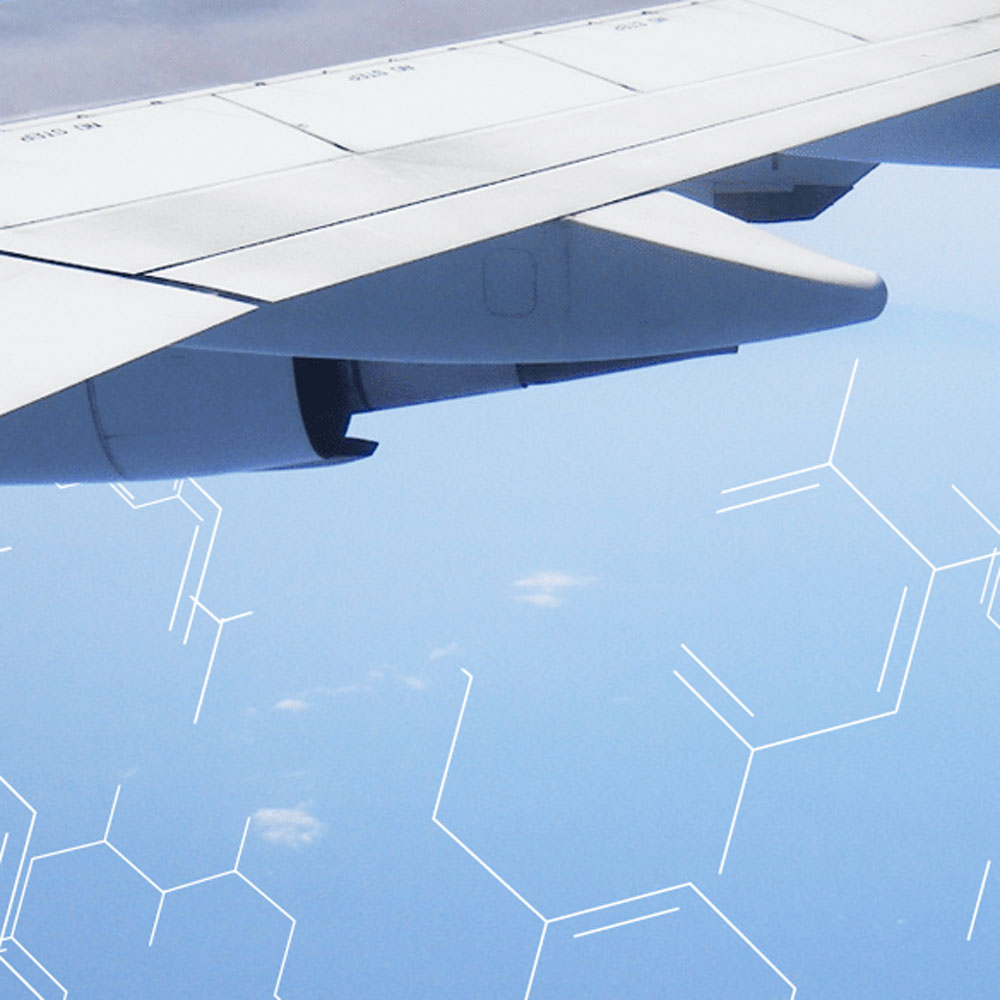
I led the website redesign for Tridox Products. I updated the logo and branding to keep the same look and feel but focused on simplifying the design.
Since this product is an industrial adhesive product that is mostly used in aerospace and engineering applications, I chose imagery of planes and molecules to represent the brand.
I served as Art Director & Marketing Director, leading design direction across Brand, Product, User Experience, and Marketing. I spearheaded a full brand redesign—including logo, packaging, and marketing strategy—and directed integrated product launch campaigns across print, digital, social media, and e-commerce, as well as sales collateral and email marketing (EDM) for both B2B and DTC audiences, ultimately driving brand awareness and sales on a global scale.
I served as the Art Director & Marketing Director at Nail Systems International, leading the design direction across branding, product packaging, customer experience, and marketing. I led integrated product launch campaigns across print, digital, social media, and e-commerce, driving brand awareness and sales.
Branding Project
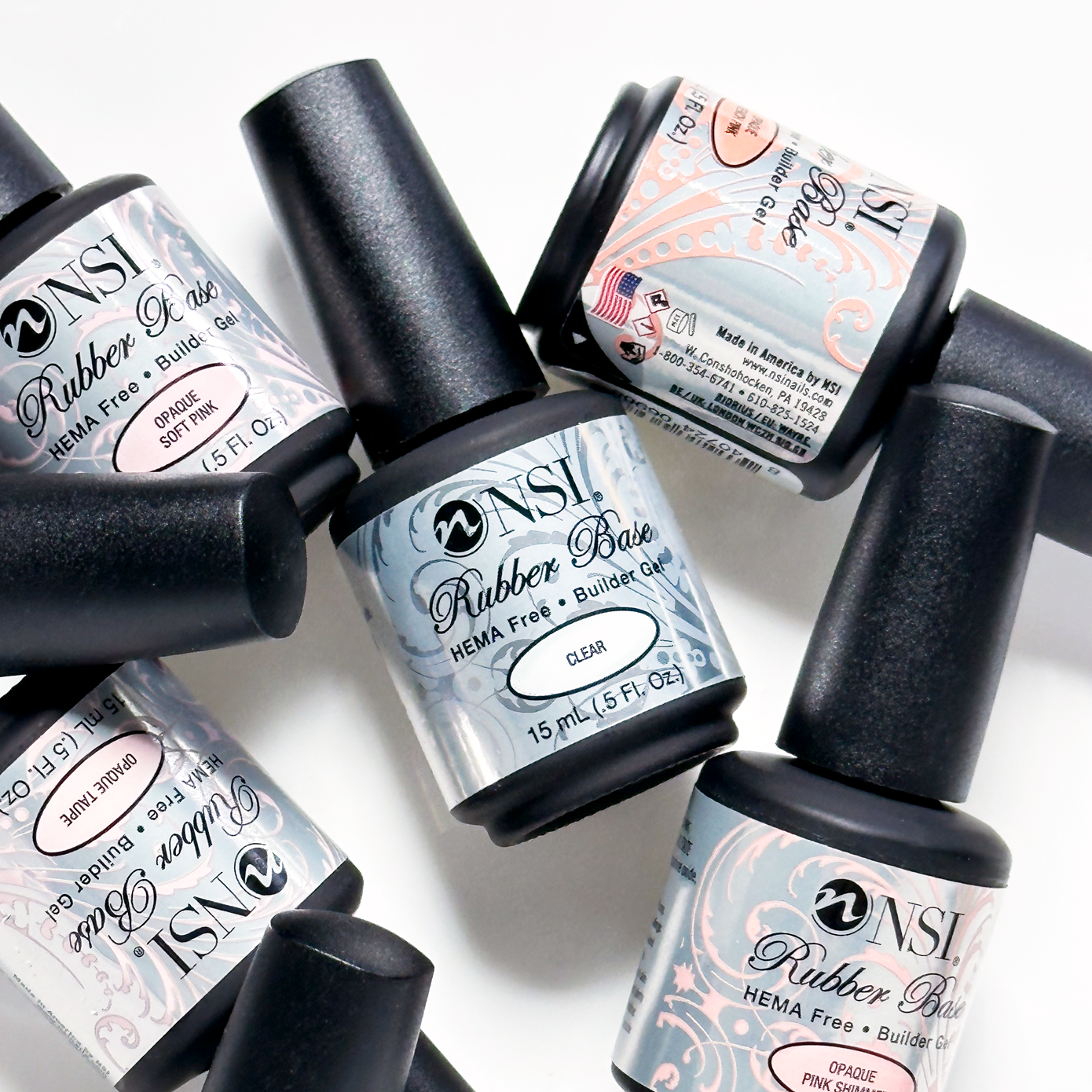
As creative director, I spearheaded the redesign of the logo and branding for Nail Systems International (NSI) to elevate the branding and mission of the company. I created a new, distinct brand strategy and marketing campaign for the rebrand that included refreshed packaging design.
The outcome: Increased brand awareness, with an updated logo that was distinctive and direct, appealing to new customers worldwide.
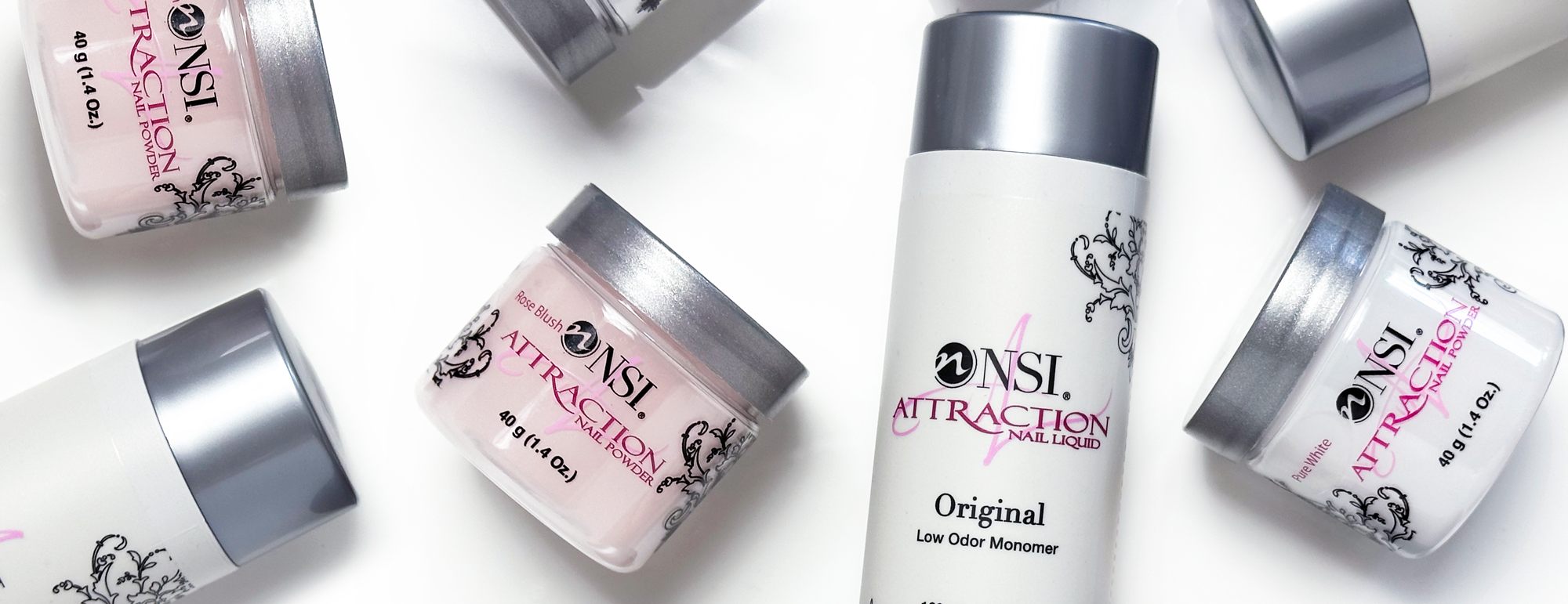
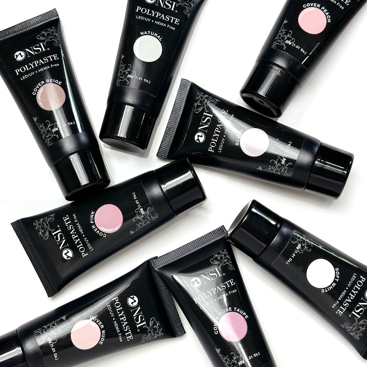
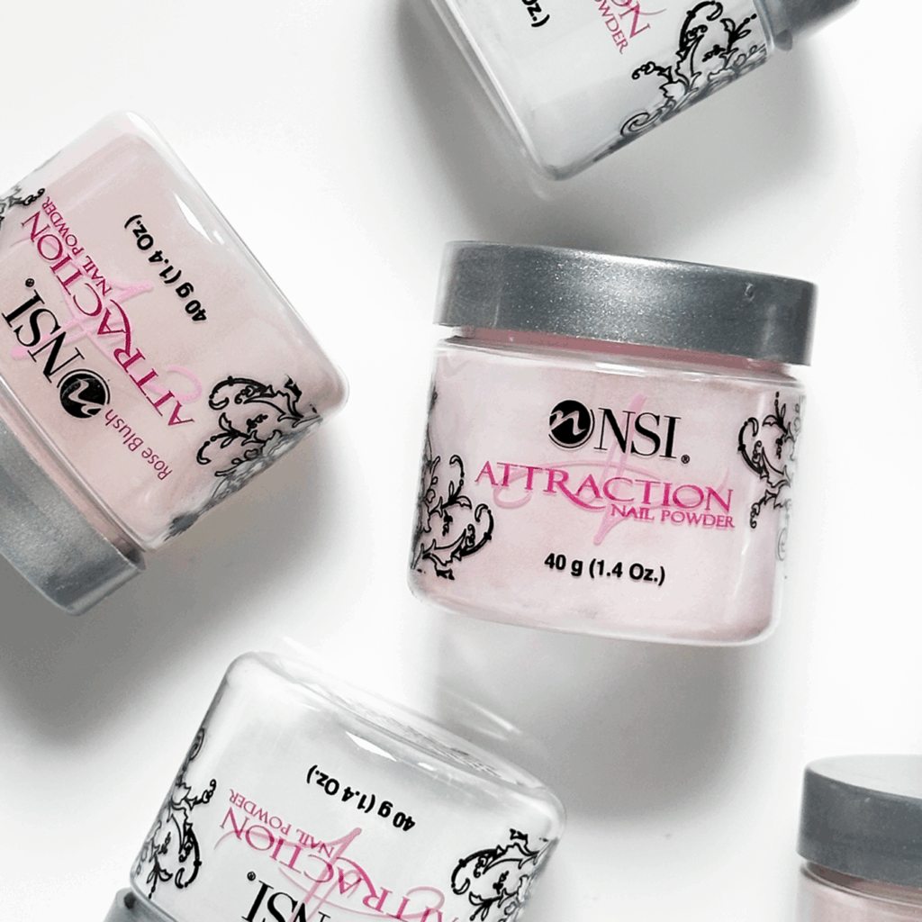
A part of the rebrand initiative for NSI included updating the packaging of the existing products to represent the new brand direction and new logo. We wanted to freshen up the packaging of the products that were already loved, while keeping some of the brand elements familiar.
For the Attraction Acrylic System, the most important product for the company, we chose to combine old and new. We chose to retain the existing product line logo to maintain familiarity and updated the overall packaging design with a fresh look. This included choosing a new bottle to represent the liquid products, and updating the labels of bottles and jars as well as product line kits.
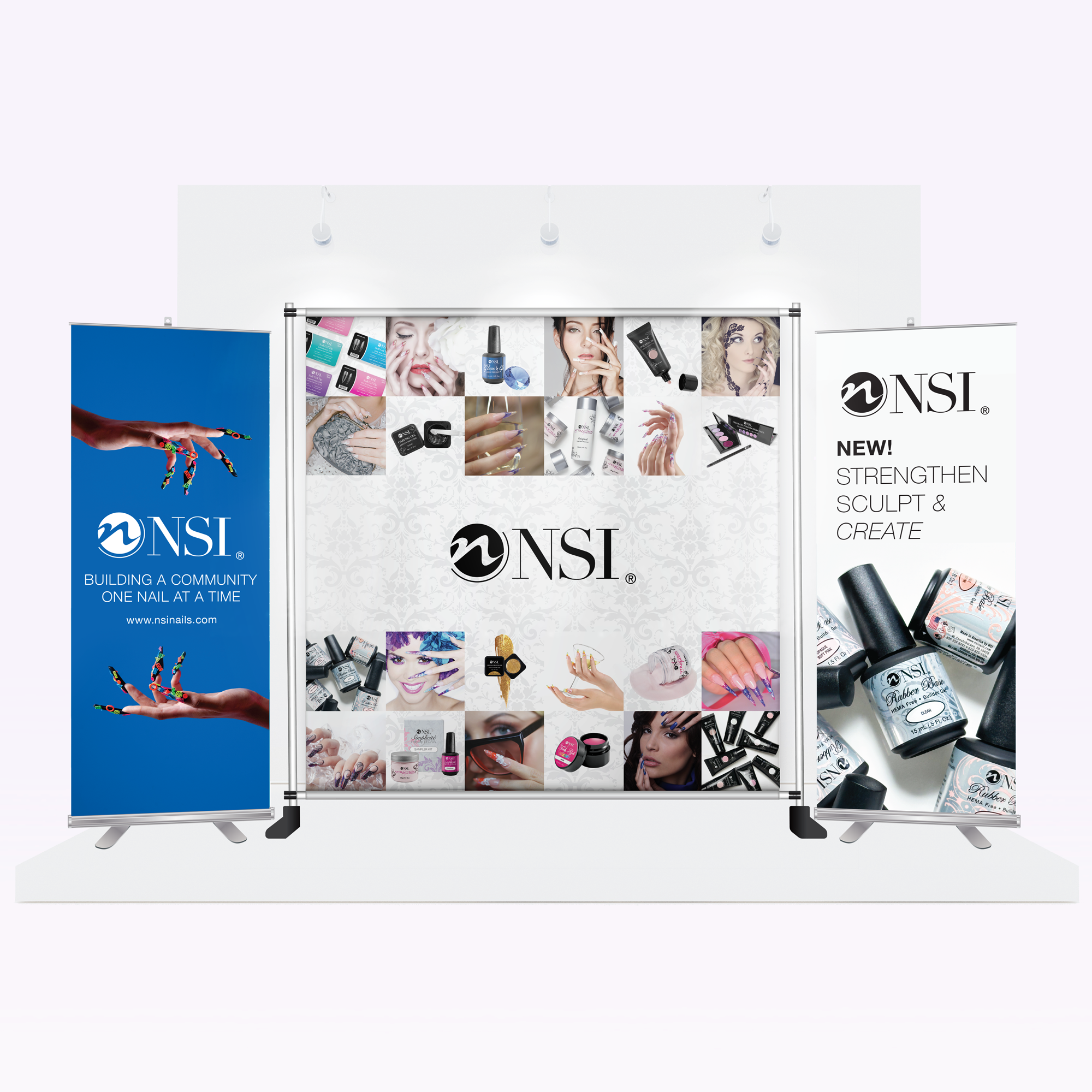
I led the design direction for the sales collateral materials for NSI and their global sales teams, for all touch points the customer would encounter. From trade show banners, catalogs, and sales folders and product sheets. Sales and marketing collateral are essential when selling b2b, introducing new products to buyers, and even communication with employees. The print materials were also distributed to new direct consumers of the product.
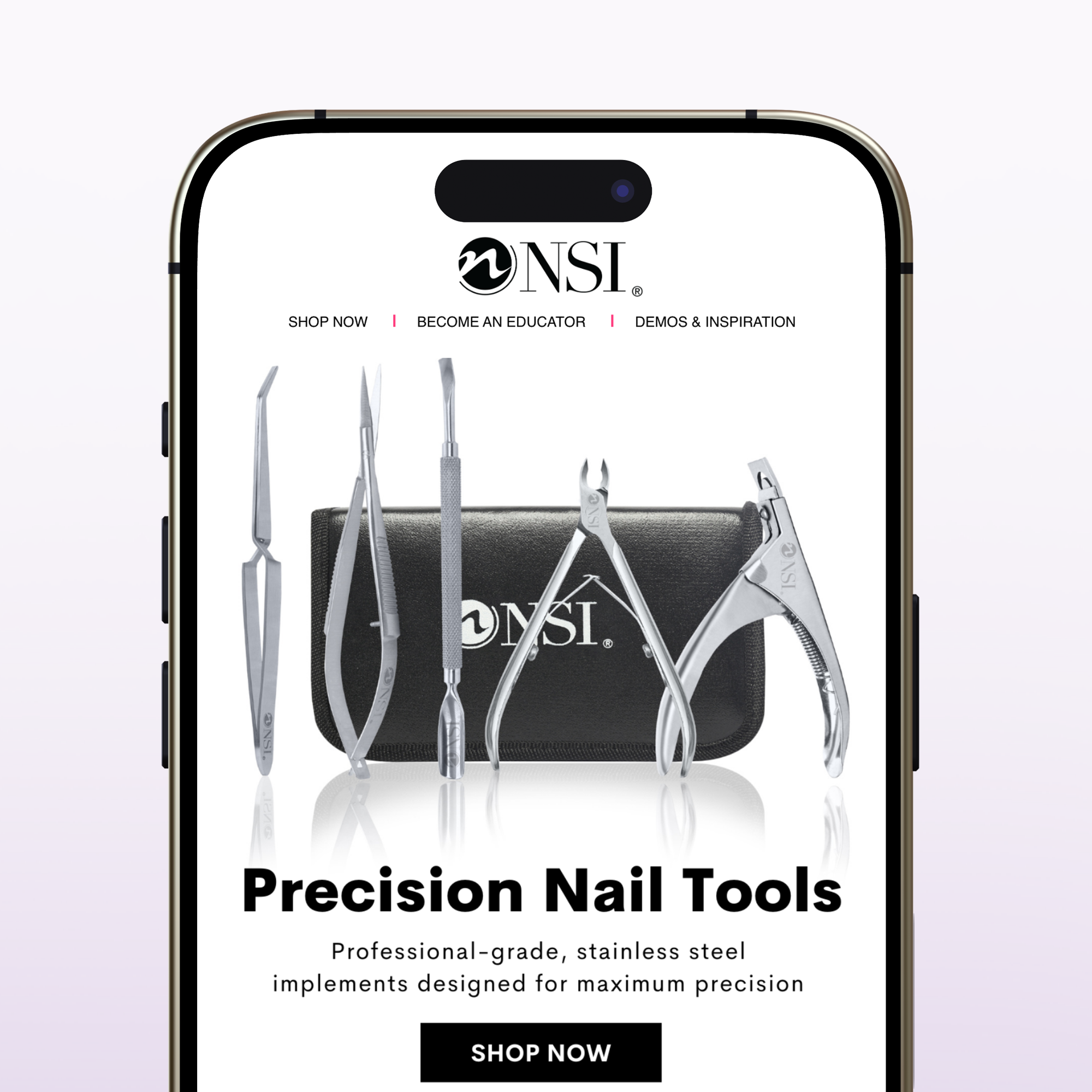
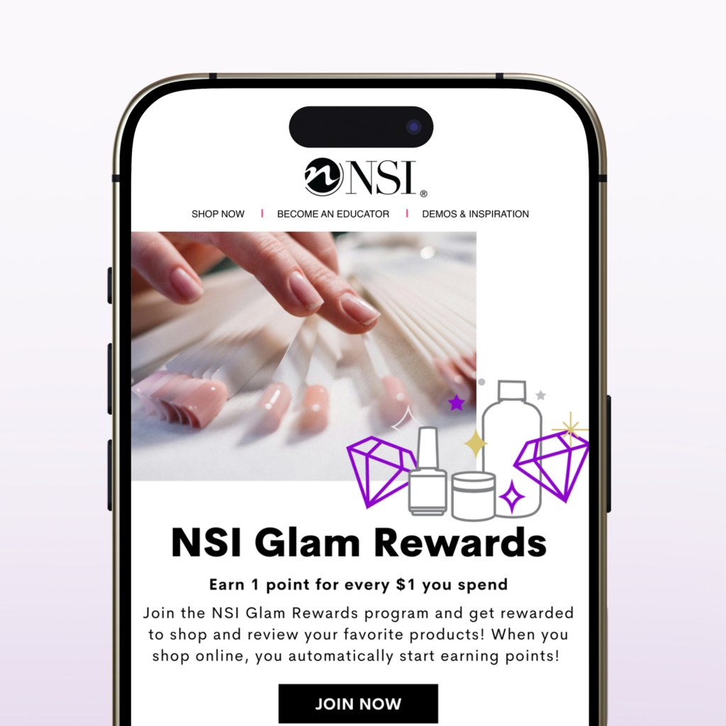
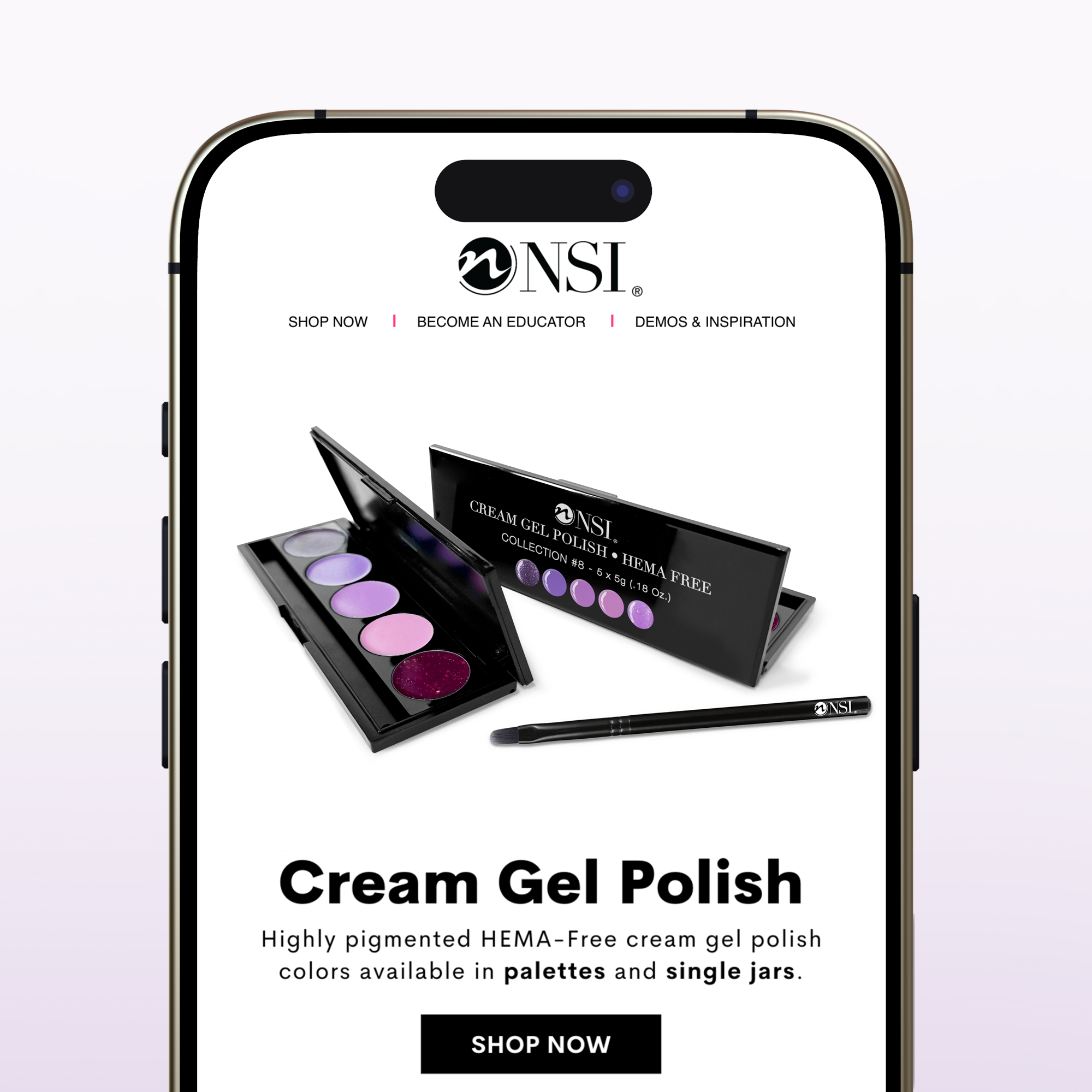
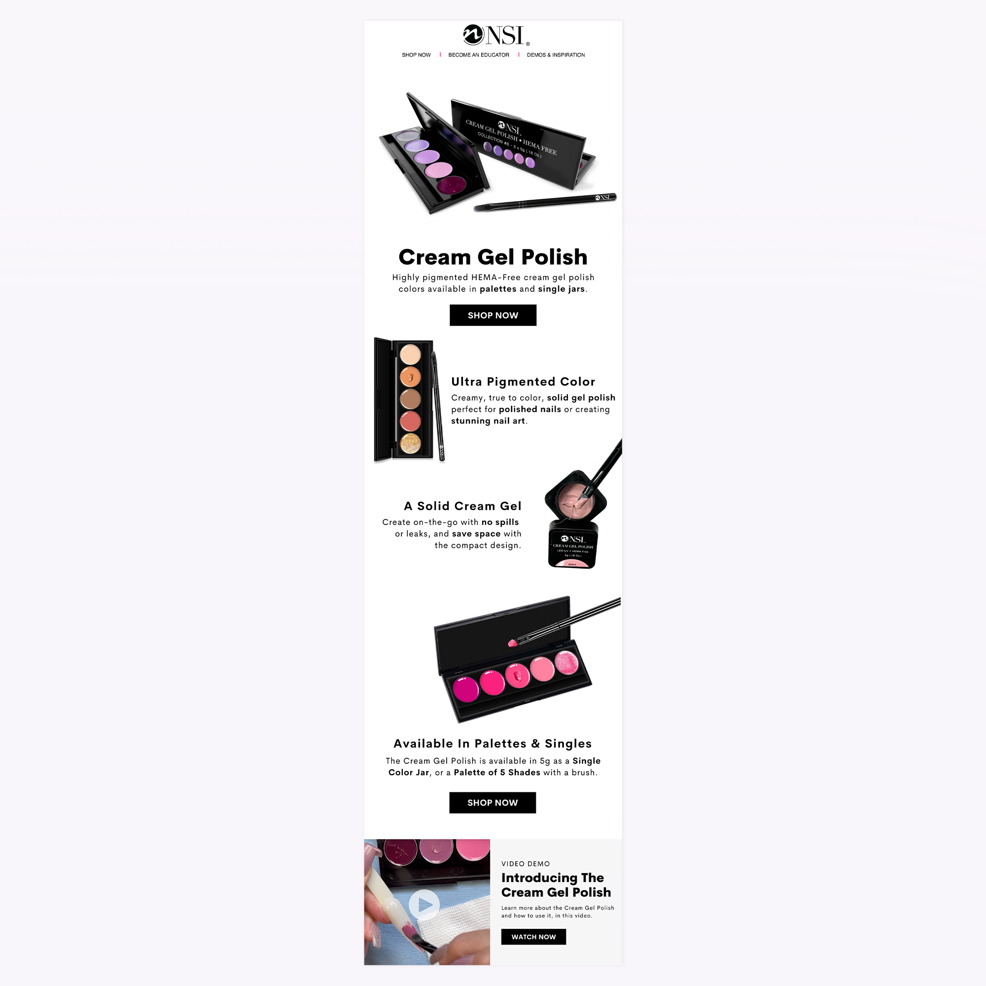
I led the creative direction on email marketing campaigns for Nail Systems International. This included drip campaigns within the customer journey, product launches, event advertising, and promotional campaigns for B2B and DTC e-commerce audiences.
I worked closely with the sales team to plan the successful launch of new products to market. From product packaging to marketing on a global scale, I played an integral role in helping the various aspects come together to make a successful product launch.
I led the creative direction aimed at reaching the intended audience, including creating the design for the product packaging and creating sales materials to be used across all forms of print, digital media, and advertising.
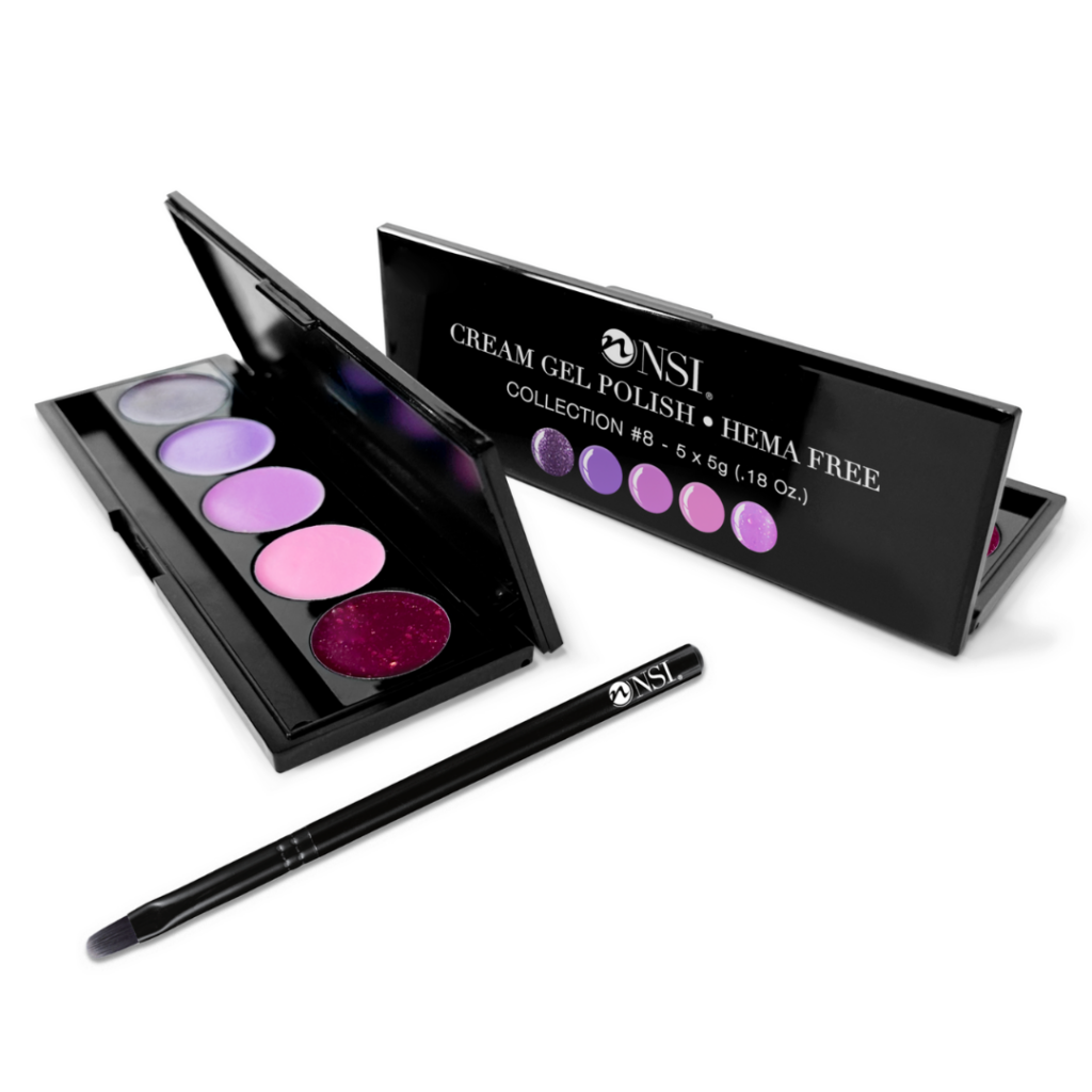
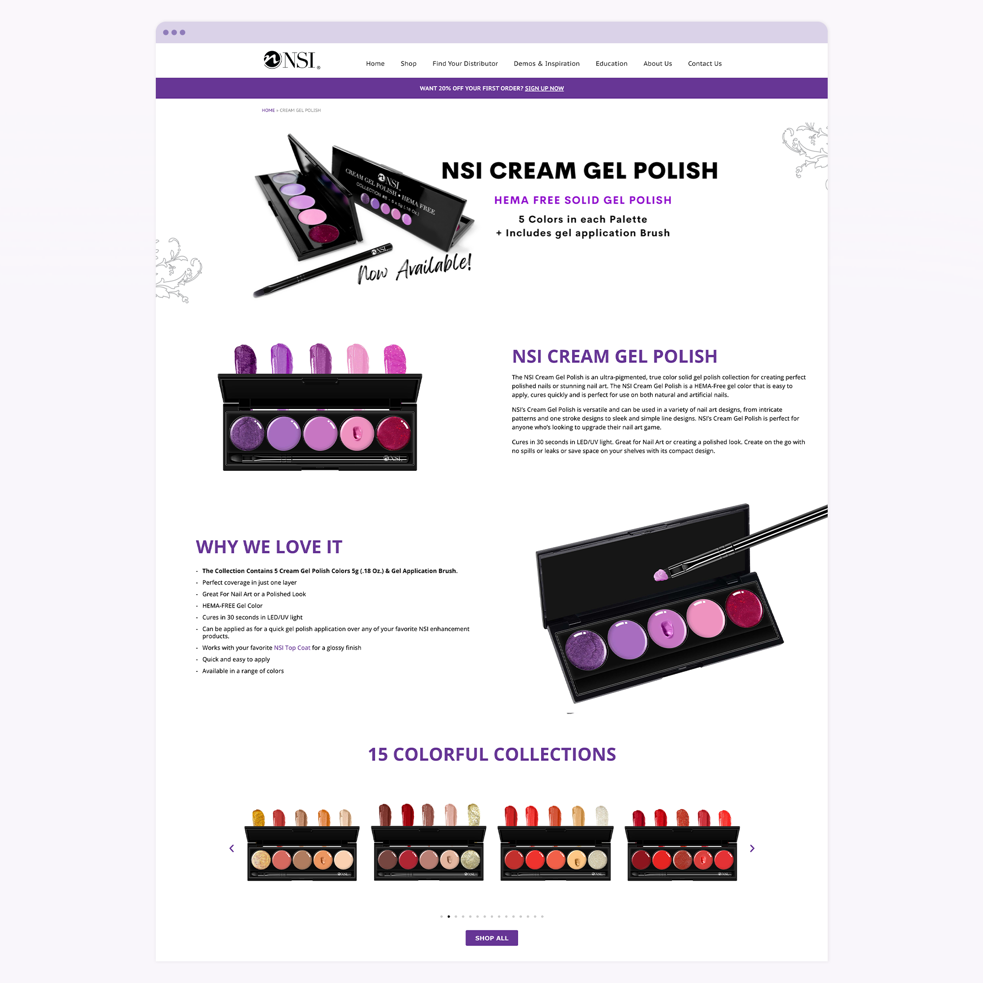
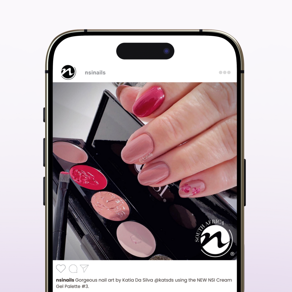
Cream gel polish was developed for nail technicians who create nail art. The cream gels are perfect to use as a palette of colors for creating detailed nail art, and are opaque enough to cover in one coat. It’s a versatile product that can be used by nail technicians of any skill level. That was the key problem to solve: Getting the product in front of the right consumer market.
Taking a product to market has a lot of components and requires a lot of planning to take it from concept to execution. From product packaging to marketing on a global scale, a lot of pieces come together to make a successful product launch.
When launching new products, I work closely with the sales team to develop a marketing plan and creative direction that is aimed at reaching the intended audience. This included creating the design for the product packaging and creating sales materials to be used across all forms of print and digital media.
Social Media Marketing
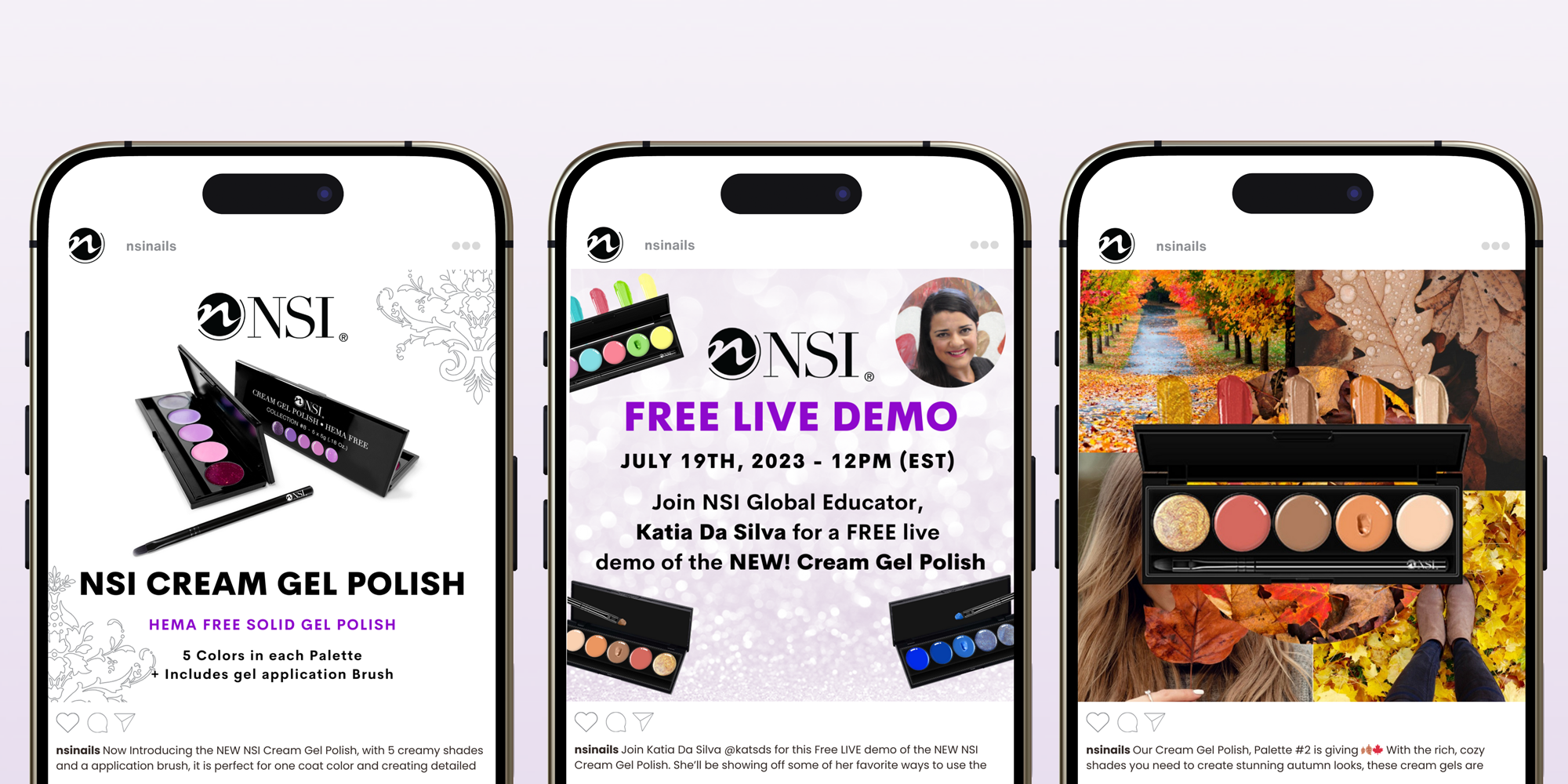
For the launch of the Cream Gel Polish, I planned a social marketing campaign with the goal of creating excitement around the product in anticipation of the launch. We introduced the product over 3 months in advance of launching the product online for sale. This meant sprinkling imagery and information about the product across social media to help excite the entire audience in our global network.
The social media campaign included a Facebook live webinar demonstration about the product in advance of the launch to show how easy the product was to use. To excite users about the possibilities of what could be created with the product, our educators created nail art designs, and I created mood board images.
The post captions strategically highlighted the benefits of the products and included relevant hashtags. To increase engagement on the posts, we encouraged users to comment on the photos. We sourced real User-Generated Content (UGC) of the products by encouraging users to share their images using the cream gel polish.
I led the design direction for the sales collateral materials for NSI and their global sales teams, for all touch points the customer would encounter. From trade show banners, catalogs, and sales folders and product sheets. Sales and marketing collateral are essential when selling b2b, introducing new products to buyers, and even communication with employees. The print materials were also distributed to new direct consumers of the product.
Digital Asset Management
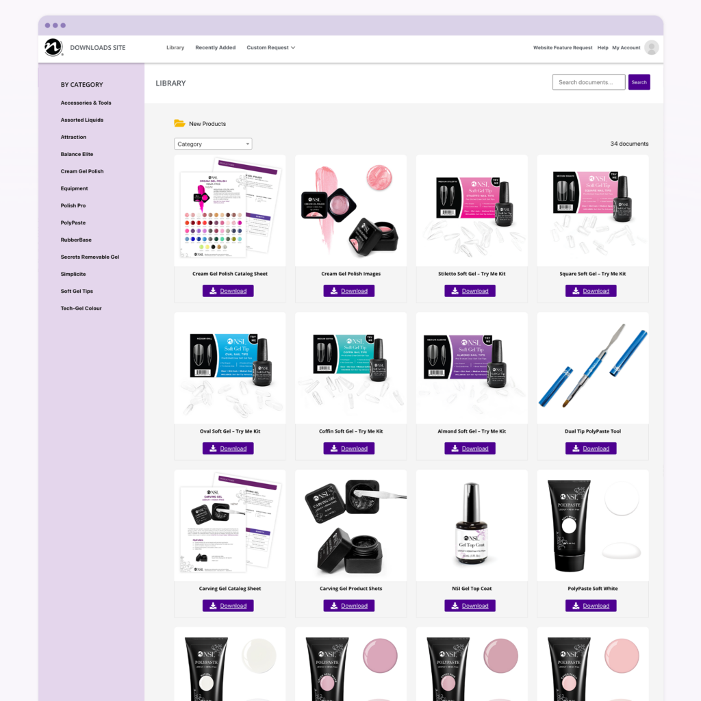
Keeping your sales and marketing materials in one place is essential for helping your sales and marketing teams access updated collateral when they need it. It also reduces downtime when asking account managers for what they need. It’s a self serve digital asset management platform.
I created a custom platform that catered to the needs of NSI and their global sales teams. This ensured that all distribution stores had access to everything they needed to create graphics and sell the product to the best of their ability. Just some of these assets included marketing materials, images, banners and more.
Toms River Yacht Club asked me to design a fun poster for the 2025 Sailabration party that reflected the events’ Luau theme. Sailabration is a fundraising event held each year to support the Barnegat Bay Yacht Racing Association.
I found inspiration in retro band posters, specifically yacht rock music like the Beach Boys and Jimmy Buffet. I also wanted to tie in the beautiful sunset view along the river.
Mid-century modern and retro design styles have always inspired me. Specifically, the Atomic Age design that we think of as “retro”. Atomic Design is where you see an emphasis on exaggerated shapes, like boomerangs, motifs like starbursts and of course sputnik stars.
I leaned into the idea of a retro summer and created a series of surface pattern designs. Mimicking the design styles seen in Atomic design, I mixed retro design elements with citrus shapes, and clean design, for playful summery patterns perfect for fabrics and textiles, or wallpaper.